
Special to Climate Depot
El Niño has not yet paused the Pause
Global temperature update: no warming for 18 years 5 months
By Christopher Monckton of Brenchley
Since December 1996 there has been no global warming at all (Fig. 1). This month’s RSS temperature – still unaffected by the most persistent el Niño conditions of the current weak cycle – shows a new record length for the Pause: 18 years 5 months.
The result, as always, comes with a warning that the temperature increase that usually accompanies an el Niño may come through after a lag of four or five months. If, on the other hand, la Niña conditions begin to cool the oceans in time, there could be a lengthening of the Pause just in time for the Paris world-government summit in December 2015.
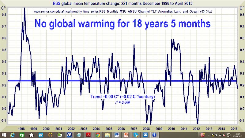
Figure 1. The least-squares linear-regression trend on the RSS satellite monthly global mean surface temperature anomaly dataset shows no global warming for 18 years 5 months since December 1996.
The hiatus period of 18 years 5 months, or 221 months, is the farthest back one can go in the RSS satellite temperature record and still show a sub-zero trend.
The divergence between the models’ predictions in 1990 (Fig. 2) and 2005 (Fig. 3), on the one hand, and the observed outturn, on the other, also continues to widen.

Figure 2. Near-term projections of warming at a rate equivalent to 2.8 [1.9, 4.2] K/century, made with “substantial confidence” in IPCC (1990), for the 303 months January 1990 to March 2015 (orange region and red trend line), vs. observed anomalies (dark blue) and trend (bright blue) at less than 1.4 K/century equivalent, taken as the mean of the RSS and UAH v. 5.6 satellite monthly mean lower-troposphere temperature anomalies.

Figure 3. Predicted temperature change, January 2005 to March 2015, at a rate equivalent to 1.7 [1.0, 2.3] Cº/century (orange zone with thick red best-estimate trend line), compared with the near-zero observed anomalies (dark blue) and real-world trend (bright blue), taken as the mean of the RSS and UAH v. 5.6 satellite lower-troposphere temperature anomalies.
The Technical Note explains the sources of the IPCC’s predictions in 1990 and in 2005, and also demonstrates that that according to the ARGO bathythermograph data the oceans are warming at a rate equivalent to less than a quarter of a Celsius degree per century. There are also details of the long-awaited beta-test version 6.0 of the University of Alabama at Huntsville’s satellite lower-troposphere dataset, which now shows a pause very nearly as long as the RSS dataset. However, the data are not yet in a form compatible with the earlier version, so v. 6 will not be used here until the beta testing is complete.
Key facts about global temperature
- The RSS satellite dataset shows no global warming at all for 221 months from December 1996 to April 2015 – more than half the 436-month satellite record.
- The global warming trend since 1900 is equivalent to 0.8 Cº per century. This is well within natural variability and may not have much to do with us.
- Since 1950, when a human influence on global temperature first became theoretically possible, the global warming trend has been equivalent to below 1.2 Cº per century.
- The fastest warming rate lasting 15 years or more since 1950 occurred over the 33 years from 1974 to 2006. It was equivalent to 2.0 Cº per century.
- In 1990, the IPCC’s mid-range prediction of near-term warming was equivalent to 2.8 Cº per century, higher by two-thirds than its current prediction of 1.7 Cº/century.
- The global warming trend since 1990, when the IPCC wrote its first report, is equivalent to below 1.4 Cº per century – half of what the IPCC had then predicted.
- Though the IPCC has cut its near-term warming prediction, it has not cut its high-end business as usual centennial warming prediction of 4.8 Cº warming to 2100.
- The IPCC’s predicted 4.8 Cº warming by 2100 is well over twice the greatest rate of warming lasting more than 15 years that has been measured since 1950.
- The IPCC’s 4.8 Cº-by-2100 prediction is almost four times the observed real-world warming trend since we might in theory have begun influencing it in 1950.
- The oceans, according to the 3600+ ARGO bathythermograph buoys, are warming at a rate equivalent to just 0.02 Cº per decade, or 0.23 Cº per century.
- Recent extreme weather cannot be blamed on global warming, because there has not been any global warming to speak of. It is as simple as that.
Technical note
Our latest topical graph shows the least-squares linear-regression trend on the RSS satellite monthly global mean lower-troposphere dataset for as far back as it is possible to go and still find a zero trend. The start-date is not “cherry-picked” so as to coincide with the temperature spike caused by the 1998 el Niño. Instead, it is calculated so as to find the longest period with a zero trend.
The satellite datasets are arguably less unreliable than other datasets in that they show the 1998 Great El Niño more clearly than all other datasets. The Great el Niño, like its two predecessors in the past 300 years, caused widespread global coral bleaching, providing an independent verification that the satellite datasets are better able to capture such fluctuations without artificially filtering them out than other datasets.
Terrestrial temperatures are measured by thermometers. Thermometers correctly sited in rural areas away from manmade heat sources show warming rates below those that are published. The satellite datasets are based on reference measurements made by the most accurate thermometers available – platinum resistance thermometers, which provide an independent verification of the temperature measurements by checking via spaceward mirrors the known temperature of the cosmic background radiation, which is 1% of the freezing point of water, or just 2.73 degrees above absolute zero. It was by measuring minuscule variations in the cosmic background radiation that the NASA anisotropy probe determined the age of the Universe: 13.82 billion years.
The RSS graph (Fig. 1) is accurate. The data are lifted monthly straight from the RSS website. A computer algorithm reads them down from the text file, takes their mean and plots them automatically using an advanced routine that automatically adjusts the aspect ratio of the data window at both axes so as to show the data at maximum scale, for clarity.
The latest monthly data point is visually inspected to ensure that it has been correctly positioned. The light blue trend line plotted across the dark blue spline-curve that shows the actual data is determined by the method of least-squares linear regression, which calculates the y-intercept and slope of the line.
The IPCC and most other agencies use linear regression to determine global temperature trends. Professor Phil Jones of the University of East Anglia recommends it in one of the Climategate emails. The method is appropriate because global temperature records exhibit little auto-regression, since summer temperatures in one hemisphere are compensated by winter in the other. Therefore, an AR(n) model generates results little different from a least-squares trend.
Dr Stephen Farish, Professor of Epidemiological Statistics at the University of Melbourne, kindly verified the reliability of the algorithm that determines the trend on the graph and the correlation coefficient, which is very low because, though the data are highly variable, the trend is flat.
RSS itself is now taking a serious interest in the length of the Great Pause. Dr Carl Mears, the senior research scientist at RSS, discusses it at remss.com/blog/recent-slowing-rise-global-temperatures.
Dr Mears’ results are summarized in Fig. T1:

Figure T1. Output of 33 IPCC models (turquoise) compared with measured RSS global temperature change (black), 1979-2014. The transient coolings caused by the volcanic eruptions of Chichón (1983) and Pinatubo (1991) are shown, as is the spike in warming caused by the great el Niño of 1998.
Dr Mears writes:
“The denialists like to assume that the cause for the model/observation discrepancy is some kind of problem with the fundamental model physics, and they pooh-pooh any other sort of explanation. This leads them to conclude, very likely erroneously, that the long-term sensitivity of the climate is much less than is currently thought.”
Dr Mears concedes the growing discrepancy between the RSS data and the models, but he alleges “cherry-picking” of the start-date for the global-temperature graph:
“Recently, a number of articles in the mainstream press have pointed out that there appears to have been little or no change in globally averaged temperature over the last two decades. Because of this, we are getting a lot of questions along the lines of ‘I saw this plot on a denialist web site. Is this really your data?’ While some of these reports have ‘cherry-picked’ their end points to make their evidence seem even stronger, there is not much doubt that the rate of warming since the late 1990s is less than that predicted by most of the IPCC AR5 simulations of historical climate. … The denialists really like to fit trends starting in 1997, so that the huge 1997-98 ENSO event is at the start of their time series, resulting in a linear fit with the smallest possible slope.”
In fact, the spike in temperatures caused by the Great el Niño of 1998 is largely offset in the linear-trend calculation by two factors: the not dissimilar spike of the 2010 el Niño, and the sheer length of the Great Pause itself.
Curiously, Dr Mears prefers the much-altered terrestrial datasets to the satellite datasets. However, over the entire length of the RSS and UAH series since 1979, the trends on the mean of the terrestrial datasets and on the mean of the satellite datasets are near-identical. Indeed, the UK Met Office uses the satellite record to calibrate its own terrestrial record.
The length of the Great Pause in global warming, significant though it now is, is of less importance than the ever-growing discrepancy between the temperature trends predicted by models and the far less exciting real-world temperature change that has been observed. It remains possible that el Nino-like conditions may prevail this year, reducing the length of the Great Pause. However, the discrepancy between prediction and observation continues to widen.
Sources of the IPCC projections in Figs. 2 and 3
IPCC’s First Assessment Report predicted that global temperature would rise by 1.0 [0.7, 1.5] Cº to 2025, equivalent to 2.8 [1.9, 4.2] Cº per century. The executive summary asked, “How much confidence do we have in our predictions?” IPCC pointed out some uncertainties (clouds, oceans, etc.), but concluded:
“Nevertheless, … we have substantial confidence that models can predict at least the broad-scale features of climate change. … There are similarities between results from the coupled models using simple representations of the ocean and those using more sophisticated descriptions, and our understanding of such differences as do occur gives us some confidence in the results.”
That “substantial confidence” was substantial over-confidence. For the rate of global warming since 1990 – the most important of the “broad-scale features of climate change” that the models were supposed to predict – is now below half what the IPCC had then predicted.
In 1990, the IPCC said this:
“Based on current models we predict:
“under the IPCC Business-as-Usual (Scenario A) emissions of greenhouse gases, a rate of increase of global mean temperature during the next century of about 0.3 Cº per decade (with an uncertainty range of 0.2 Cº to 0.5 Cº per decade), this is greater than that seen over the past 10,000 years. This will result in a likely increase in global mean temperature of about 1 Cº above the present value by 2025 and 3 Cº before the end of the next century. The rise will not be steady because of the influence of other factors” (p. xii).
Later, the IPCC said:
“The numbers given below are based on high-resolution models, scaled to be consistent with our best estimate of global mean warming of 1.8 Cº by 2030. For values consistent with other estimates of global temperature rise, the numbers below should be reduced by 30% for the low estimate or increased by 50% for the high estimate” (p. xxiv).
The orange region in Fig. 2 represents the IPCC’s less extreme medium-term Scenario-A estimate of near-term warming, i.e. 1.0 [0.7, 1.5] K by 2025, rather than its more extreme Scenario-A estimate, i.e. 1.8 [1.3, 3.7] K by 2030.
Some try to say the IPCC did not predict the straight-line global warming rate that is shown in Figs. 2-3. In fact, however, the IPCC’s predicted global warming over so short a term as the 25 years from 1990 to the present are little different from a straight line (Fig. T2).

Figure T2. Historical warming from 1850-1990, and predicted warming from 1990-2100 on the IPCC’s “business-as-usual” Scenario A (IPCC, 1990, p. xxii).
Because this difference between a straight line and the slight uptick in the warming rate the IPCC predicted over the period 1990-2025 is so small, one can look at it another way. To reach the 1 K central estimate of warming since 1990 by 2025, there would have to be twice as much warming in the next ten years as there was in the last 25 years. That is not likely.
Likewise, to reach 1.8 K by 2030, there would have to be four or five times as much warming in the next 15 years as there was in the last 25 years. That is still less likely.
But is the Pause perhaps caused by the fact that CO2 emissions have not been rising anything like as fast as the IPCC’s “business-as-usual” Scenario A prediction in 1990? No: CO2 emissions have risen rather above the Scenario-A prediction (Fig. T3).

Figure T3. CO2 emissions from fossil fuels, etc., in 2012, from Le Quéré et al. (2014), plotted against the chart of “man-made carbon dioxide emissions”, in billions of tonnes of carbon per year, from IPCC (1990).
Plainly, therefore, CO2 emissions since 1990 have proven to be closer to Scenario A than to any other case, because for all the talk about CO2 emissions reduction the fact is that the rate of expansion of fossil-fuel burning in China, India, Indonesia, Brazil, etc., far outstrips the paltry reductions we have achieved in the West to date.
True, methane concentration has not risen as predicted in 1990 (Fig. T4), for methane emissions, though largely uncontrolled, are simply not rising as the models had predicted, and the predictions were extravagantly baseless.
The overall picture is clear. Scenario A is the emissions scenario from 1990 that is closest to the observed emissions outturn, and yet there has only been a third of a degree of global warming since 1990 – about half of what the IPCC had then predicted with what it called “substantial confidence”.

Figure T4. Methane concentration as predicted in four IPCC Assessment Reports, together with (in black) the observed outturn, which is running along the bottom of the least prediction. This graph appeared in the pre-final draft of IPCC (2013), but had mysteriously been deleted from the final, published version, inferentially because the IPCC did not want to display such a plain comparison between absurdly exaggerated predictions and unexciting reality.
To be precise, a quarter-century after 1990, the global-warming outturn to date – expressed as the least-squares linear-regression trend on the mean of the RSS and UAH monthly global mean surface temperature anomalies – is 0.35 Cº, equivalent to just 1.4 Cº/century, or a little below half of the central estimate of 0.70 Cº, equivalent to 2.8 Cº/century, that was predicted for Scenario A in IPCC (1990). The outturn is visibly well below even the least estimate.
In 1990, the IPCC’s central prediction of the near-term warming rate was higher by two-thirds than its prediction is today. Then it was 2.8 C/century equivalent. Now it is just 1.7 Cº equivalent – and, as Fig. T5 shows, even that is proving to be a substantial exaggeration.
Is the ocean warming?
One frequently-discussed explanation for the Great Pause is that the coupled ocean-atmosphere system has continued to accumulate heat at approximately the rate predicted by the models, but that in recent decades the heat has been removed from the atmosphere by the ocean and, since globally the near-surface strata show far less warming than the models had predicted, it is hypothesized that what is called the “missing heat” has traveled to the little-measured abyssal strata below 2000 m, whence it may emerge at some future date.
Actually, it is not known whether the ocean is warming: each of the 3600 automated ARGO bathythermograph buoys somehow has to cover 200,000 cubic kilometres of ocean – a 100,000-square-mile box more than 316 km square and 2 km deep. Plainly, the results on the basis of a resolution that sparse (which, as Willis Eschenbach puts it, is approximately the equivalent of trying to take a single temperature and salinity profile taken at a single point in Lake Superior less than once a year) are not going to be a lot better than guesswork.
Fortunately, a long-standing bug in the ARGO data delivery system has now been fixed, so I am able to get the monthly global mean ocean temperature data – though ARGO seems not to have updated the dataset since December 2014. However, that gives us 11 full years of data. Results are plotted in Fig. T5. The ocean warming, if ARGO is right, is equivalent to just 0.02 Cº decade–1, or 0.2 Cº century–1 equivalent.

Figure T5. The entire near-global ARGO 2 km ocean temperature dataset from January 2004 to December 2014 (black spline-curve), with the least-squares linear-regression trend calculated from the data by the author (green arrow).
Finally, though the ARGO buoys measure ocean temperature change directly, before publication NOAA craftily converts the temperature change into zettajoules of ocean heat content change, which make the change seem a whole lot larger.
The terrifying-sounding heat content change of 260 ZJ from 1970 to 2014 (Fig. T6) is equivalent to just 0.2 K/century of global warming. All those “Hiroshima bombs of heat” are a barely discernible pinprick. The ocean and its heat capacity are a lot bigger than some may realize.

Figure T6. Ocean heat content change, 1957-2013, in Zettajoules from NOAA’s NODC Ocean Climate Lab: http://www.nodc.noaa.gov/OC5/3M_HEAT_CONTENT, with the heat content values converted back to the ocean temperature changes in fractions of a Kelvin that were originally measured. NOAA’s conversion of the minuscule temperature change data to Zettajoules, combined with the exaggerated vertical aspect of the graph, has the effect of making a very small change in ocean temperature seem considerably more significant than it is.
Converting the ocean heat content change back to temperature change reveals an interesting discrepancy between NOAA’s data and that of the ARGO system. Over the period of ARGO data, from 2004-2014, the NOAA data imply that the oceans are warming at 0.05 Cº decade–1, equivalent to 0.5 Cº century–1, or rather more than double the rate shown by ARGO.
ARGO has the better-resolved dataset, but since the resolutions of all ocean datasets are very low one should treat all these results with caution. What one can say is that, on such evidence as these datasets are capable of providing, the difference between underlying warming rate of the ocean and that of the atmosphere is not statistically significant, suggesting that if the “missing heat” is hiding in the oceans it has magically found its way into the abyssal strata without managing to warm the upper strata on the way. On these data, too, there is no evidence of rapid or catastrophic ocean warming.
Furthermore, to date no empirical, theoretical or numerical method, complex or simple, has yet successfully specified mechanistically either how the heat generated by anthropogenic greenhouse-gas enrichment of the atmosphere has reached the deep ocean without much altering the heat content of the intervening near-surface strata or how the heat from the bottom of the ocean may eventually re-emerge to perturb the near-surface climate conditions that are relevant to land-based life on Earth.
Most ocean models used in performing coupled general-circulation model sensitivity runs simply cannot resolve most of the physical processes relevant for capturing heat uptake by the deep ocean. Ultimately, the second law of thermodynamics requires that any heat which may have accumulated in the deep ocean will dissipate via various diffusive processes. It is not plausible that any heat taken up by the deep ocean will suddenly warm the upper ocean and, via the upper ocean, the atmosphere.
If the “deep heat” explanation for the hiatus in global warming were correct (and it is merely one among dozens that have been offered), then the complex models have failed to account for it correctly: otherwise, the growing discrepancy between the predicted and observed atmospheric warming rates would not have become as significant as it has.
The UAH v. 6.0 dataset
The long-awaited new version of the UAH dataset is here at last. The headline change is that the warming trend has fallen from 0.14 to 0.11 C° per decade since 1979. The UAH and RSS datasets are now very close to one another, and there is a clear difference between the warming rates shown by the satellite and terrestrial datasets.
Roy Spencer’s website, drroyspencer.com, has an interesting explanation of the reasons for the change in the dataset. When I mentioned to him that the usual suspects would challenge the alterations that have been made to the dataset, he replied: “It is what it is.” In that one short sentence, true science is encapsulated.
Below, Fig. T7 shows the two versions of the UAH dataset superimposed on one another. Fig. T8 plots the differences between the two versions.

Fig. T7. The two UAH versions superimposed on one another.

Fig. T8. Difference between UAH v. 6 and v. 5.6.
Related Link:


24 Responses
Bravo and thank you as always Lord Monckton!
You evil flat earther!!!! I love it.
Since the pope is so concerned about climate change–only as it relates to his Liberation Theology constructs of social justice–maybe he should ban all liturgical candle lighting. One can only imagine how much millions of the faithful lighting candles is warming the earth. Such a ban might even see the RSS temp data set take a nose dive into negative territory.
Thanks for staying on this, despite the numerous personal attacks and ad homs, Christopher.
❋✦✧❋✦✧GET Profit Sitting h0me with Google Finance@ng7::
➨➨➨➨https://DesktopJ0bsCr0wd.com/work/care…
Monckton draws attention to the “pause”. I maintain that continuing to discus the “pause ” essentially concedes the policy argument to the IPCC and UNFCCC. The term implies that global warming will return sometime. The CAGW propagandists merely then come up with one of their specious ad hoc excuses for the ” pause” and say we need to control GHGs because CAGW warming will come roaring back soon .
There is good evidence that we have entered the descending, i.e. cooling, phase of the millennial solar activity cycle and that phase will last until about 2650
There is little point in following the IPCC models and forecasting climate trends ahead linearly when the climate is clearly controlled by natural orbital cycles and cycles in solar activity – most importantly on a time scale of human interest the millennial solar activity cycle?
It is of interest that the trends in the new UAH v6 satellite temperature time series are now much closer to the RSS satellite data,. In particular they confirm the RSS global cooling trend since 2003 when the natural millennial solar activity driven temperature cycle peaked.
see
http://www.woodfortrees.org/graph/rss/from:1980.1/plot/rss/from:1980.1/to:2003.6/trend/plot/rss/from:2003.6/trend
It is the satellite data sets which should be used in climate discussions because the land and sea based data sets have been altered and manipulated so much over the years in order to make them conform better with the model based CAGW agenda.
The IPCC climate models are built without regard to the natural 60 and more importantly this 1000 year periodicity so obvious in the temperature record. This approach is simply a scientific disaster and lacks even average commonsense .It is exactly like taking the temperature trend from say Feb – July and projecting it ahead linearly for 20 years or so. The models are back tuned for less than 100 years when the relevant time scale is millennial. This is scientific malfeasance on a grand scale.
The temperature projections of the IPCC – Met office models and all the impact studies which derive from them have no solid foundation in empirical science being derived from inherently useless and specifically structurally flawed models. They provide no basis for the discussion of future climate trends and represent an enormous waste of time and money. As a foundation for Governmental climate and energy policy their forecasts are already seen to be grossly in error and are therefore worse than useless.
A new forecasting paradigm urgently needs to be adopted and publicized ahead of the Paris meeting.
For forecasts of the timing and extent of the coming cooling based on the natural solar activity cycles – most importantly the millennial cycle – and using the neutron count and 10Be record as the most useful proxy for solar activity check my blog-post at
http://climatesense-norpag.blogspot.com/2014/07/climate-forecasting-methods-and-cooling.html
The most important factor in climate forecasting is where earth is in regard to this quasi- millennial natural solar activity cycle which has a period in the 960 – 1020 year range. For evidence of this cycle see Figs 5-9. From Fig 9 it is obvious that the earth is just approaching ,just at or just past a peak in the millennial cycle. I suggest that more likely than not the general trends from 1000- 2000 seen in Fig 9 will likely repeat from 2000-3000 with the depths of the next LIA at about 2650. The best proxy for solar activity is the neutron monitor the count and 10 Be data.Based on the Oulu neutron count – Fig 14 the solar activity millennial maximum peaked in Cycle 22 in about 1991. There is a varying lag between the change in the in solar activity and the change in the different temperature metrics. There is a 12 year delay between the neutron peak and the probable millennial cyclic temperature peak seen in the RSS data in 2003.
There has been a declining temperature trend since then (Usually mis-interpreted as a “pause”) There is likely to be a steepening of the cooling trend in 2017- 2018 corresponding to the very important Ap index break below all recent base values in 2005-6. Fig 13. The Polar excursions of the last few winters are harbingers of even more extreme winters to come more frequently in the near future.
It is important that prominent spokesmen for the skeptic cause speak out forcefully prior to the Paris meetings so that decisions could be based more solidly on the real world data rather than the virtual delusory world of the CAGW propagandists projections. It would be helpful if Marc Morano could ,in future presentations, state that the earth is now past the millennial temperature peak and headed for several hundred years of general cooling modified from time to time by the shorter multi-decadal and centennial periodicities.( 60 year, Gleissberg and de Vries cycles.)
Dr. Page, over the last decade, looking at the history of the solar cycle and our sun currently, I have become very convinced that we may soon enter a minimum that may well seem like the fellows in the 70’s were right after all.
The thing in all this nonsense that I find quite amusing is the red herring of CO2. Currently with CO2 at 390 PPM, if it drops just 0.025% per million, all life on earth will die. Considering that historically it has been 2000 PPM and life is still here? What did Her Hitler tell the propagandists? … use a lie so “colossal” that no one would believe that someone “could have the impudence to distort the truth so infamously.”
Thank you for stepping up to the plate Dr. Page.
CO2 concentrations may have been as high as 7,000 ppm, actually. But that was at a time when the land was essentially barren and almost all life existed in the ocean. From the dawn of humanity until a few years ago, humanity has always lived with CO2 under 250 ppm.
BTW, the phrase you intended is “Herr Hitler,” which means “Mr. Hitler.” “Her Hitler” was a lingerie line Hitler designed back when he was an art student.
“>>> CO2 concentrations may have been as high as 7,000 ppm, actually. But that was at a time when the land was essentially barren and almost all life existed in the ocean. <<<"
Not really. According to [1] CO2 atmospheric concentration was still twice what it's today 50 million years ago, when life flourished, and stayed above present levels for most of the past 50 million years, on average. But, yes, it's been declining ever since, dropping to levels below those required for life to be sustained during recent glaciation periods [2]. And this is not a good thing. We are doing Nature a favor, taking all this carbon wasting under ground and putting it back where it belongs, in the atmosphere. Atmospheric carbon dioxide is where all life on Earth is anchored, since it is a foundation of all food chains. The more CO2 in the atmosphere, the more life can flourish.
[1] doi:10.1073pnas.022055499
[2] doi:10.1073pnas.0408315102
Yes, I agree. This is likely not a “pause” but a “maximum,” hence the flatlining of the average global temperature. The sun does appear to be a #1 driver: the solar activity grand maximum in the 20th century resulting in warming (but note how very little of that warming there really was, less than 0.7C altogether), then a drop in the solar activity level and… pronto! temperatures flatline and even begin to diminish slowly. The ocean, being a huge heat reservoir, slows down the process by decades, but not forever.
This also explains the visible panic amongst warm-mongers and their desperate attempt to impose restrictions upon the world before it becomes too obvious to all that there is no “global warming.” They probably hope that by the time it happens, they’ll be able to claim, it’s because of their policies. But this is not going to work for them if, as predicted, we’ll see pronounced cooling by 2030. The world’s CO2 emissions will continue to rise: China promised this in their “agreement” with Obama (unrestricted CO2 growth for another 15 years), so does India and other developing countries. Even if the US and EU reduce their own emissions, which is not going to happen in the US if conservatives win the presidency anyway, it’ll be too little to offset the growth in the developing countries.
Here’s some advice to Brazil, Russia, India, China, South Africa (BRICS) and Indonesia: agree to nothing in Paris. Wait until 2030, at least.
A comment on how to evaluate the duration of the “pause.” It’s important to include data scatter in the computation, that is, not only to evaluate the slope, but the error in the slope, the +/- bit, as well. Then keep extending the data sample backwards until the slope with the +/- bit becomes such that the zero is no longer within the error bound. This is, I think, the spirit of the HAC-Robust trend variance estimator that, when applied to climate data, should return the “pause” duration of about 20 years by now [1].
[1] doi:10.4236/ojs.2014.47050
One of the problems I have is the acceptance that the particle physics of a minor gas are being used to explain the heating effects of CO2. I would like to hear the precise mechanism for this!
I see CO2 as being released from water by heat. How can the cause, heat, now be the effect of CO2 in the atmosphere? This would be a positive feedback system.
The mechanism has been written about for decades. You just need to open a climate textbook to chapter 2.
✈✔➨✈✔➨start freelancing at Home with Google Finance@nr1:::
>.
➨➨➨➨https://BestHome-Jobs5Services.com/homes/positi0ns….
As we know the climate is subject to natural cycles. If AGW managed to override all those cycles we would already be in a much deeper hole than even the IPCC dare to describe.
Also climate can only be measured in decades not months. As it is. CO2 concentrations are 33% higher than at any time in 800,000 years and the ten warmest years on record have all occurred since 1998. An amazing coincidence.
By the way 1998 was also an exceptional el nino year, which may explain the apparent ‘cooler’ period.
Or maybe this is just God’s way of saying, i’ll give you guys a few more years to come to terms with the destruction you are creating, Whichever, the planet is warming, people are losing their habitats, icecaps and glaciers are now in unstoppable retreat, the frequency and intensity of storms are increasing and tnose living on the edge are dying.
But the fossil fuel industry is pleading innocent to anyone they can pay to listen.
Fortunately those people are becoming fewer and fewer.
When they stop trying to draw straight lines through everything and fitting the proper curves, I’ll start thinking there are people with brains making these graphs. The AGW rock-stupid meme that all natural cycles have been over-ridden by CO2 and, since CO2 is steadily rising, these jello-brains think straight lines have some meaning. NATURE DOES NOT DO STRAIGHT LINES. Period.
The 10 hottest years is BS. Period. All the data has been manufactured. As proof. Tell me what the global temperature change was from 1939 to 1979.
Measuring global temperatures and CO2 is like trying to measure the temperature of tap water. There are many variables in the delivery system that will constantly vary the temps. Likewise the fact that plants take in CO2 and produce O2 is also problematic in these models.
Greenpeace cofounder Dr. Patrick Moore has had the most interesting comments on this to date. Some of his assertions are scary considering the current jackbooted lock step approach that the “Global Climate change crowd” has embarked on
“CO2 is the most important nutrient for all life on earth,”
“So it is virtually impossible to think of doing an experiment where we would be able to tweeze out the impact of CO2 versus the hundreds of other variables at work. Which is why you could never make a model that would predict the climate,”
‘When modern life evolved over 500 million years ago, CO2 was more than 10 times higher than today, yet life flourished at this time. Then an Ice Age occurred 450 million years ago when CO2 was 10 times higher than today. There is some correlation, but little evidence, to support a direct causal relationship between CO2 and global temperature through the millennia. The fact that we had both higher temperatures and an ice age at a time when CO2 emissions were 10 times higher than they are today fundamentally contradicts the certainty that human-caused CO2 emissions are the main cause of global warming.’
So we are told CO2 is a “toxic” “pollutant” that must be curtailed when in fact it is a colourless, odourless, tasteless, gas present at 400 parts per million of the global atmosphere and the most important food for life on earth. Without CO2 above 150 parts per million, all plants would die.
Over the past 150 million years, CO2 had been drawn down steadily (by plants) from about 3000 parts per million to about 280 parts per million before the industrial revolution. If this trend had continued, CO2 would have become too low to support life on Earth. Human use of fossil fuels and clearing land for crops have boosted CO2 from its lowest level in the history of the Earth back to 400 parts per million today.
At 400 parts per million, all our food crops, forests, and natural ecosystems are still on a starvation diet for CO2. While one wing of CSIRO promotes the IPCC line, another is demonstrating the positive impact of the small increase in CO2 over the past 50 years due primarily to fossil fuel use — a 10 per cent to 30 per cent increase in plant growth in many regions. Australia is benefiting more than most because its vegetation evolved for dry conditions. Increased CO2 means plants don’t need as much water, so our deserts are lusher.
I have 40 years experience in analyzing data, and I took a look at the RSS and UAH data sets for the last 18 years and 5 months (http://diaryofthelastage.blogspot.com/2015/05/yes-global-temperatures-are-currently.html). The assumption of Monckton’s analysis, that the trend is linear over the entire range, is a very strong assumption. The LOESS (locally weighted) regression model relaxes that. With this model, I find that the while there was a pause in the middle of the 2000’s, the temperature began increasing in 2009. This analysis isn’t definitive, but is evidence that global temperatures really are now increasing.
Ok, but still ha’ve not reached the levels seen in the renaissance. Significant? Yes, because the renaissance predates the industrial revolution. As Patrick Moore the cofounder of Greenpeace has pointed out on a couple of occasions in earlier civilization when CO2 levels were 3 times current levels we saw an extreme warm period and an ice age. So for all this to make sense you have to discount a considerable part of history. If you extend the time line out too far, man mad global warming theory (or hypothesis more correctly) falls apart and the hockey stick just turns into a stick.
I visited the Volcano Etna a few days ago. Scilly is well known for its fertility, the soil is good, with an abundance of water. However there is also CO2 being emitted continuously, the slopes below the tree line are very green and lush. Has anyone ever checked the CO2 levels around this or similar always semi active volcanic mountains of around 6-7000 feet? Do others have similar fertility.
Fossil fuels burned by man emit 100-200 times more CO2 than do volcanoes:
“Volcanic vs Anthropogenic Carbon Dioxide,” T Gerlach, EOS v92 n24, June 14, 2011.
http://www.agu.org/pubs/pdf/2011EO240001.pdf
http://www.woodfortrees.org/gr…
charismanews.com
Thanks for sharing the source link to the group collecting the Satellite Data. Particularly the link about their response to “the pause.
The team collecting and analysing the data obviously don’t think there’s a problem with AGW, but they would like to understand why the rates of change has slowed. It’s just the way science would behave – they are looking for the causes of the slowdown. Recent RSS data shows an acceleration of warming in the lower Troposphere. RSS data can be spun to show show a “pause” or not show a pause. Browse the data here http://images.remss.com/msu/msu_time_series.html