
Special To Climate Depot
The Pause lengthens yet again
A new record Pause length: no warming for 18 years 8 months
By Christopher Monckton of Brenchley
One-third of Man’s entire influence on climate since the Industrial Revolution has occurred since January 1997. Yet for 224 months since then there has been no global warming at all (Fig. 1). With this month’s RSS (Remote Sensing Systems) temperature record, the Pause sets a new record at 18 years 8 months.
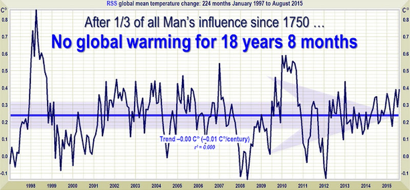
Figure 1. The least-squares linear-regression trend on the RSS satellite monthly global mean surface temperature anomaly dataset shows no global warming for 18 years 8 months since January 1997, though one-third of all anthropogenic forcings occurred during the period of the Pause.
As ever, a warning about the current el Niño. It is becoming ever more likely that the temperature increase that usually accompanies an el Niño will begin to shorten the Pause somewhat, just in time for the Paris climate summit, though a subsequent La Niña would be likely to bring about a resumption and perhaps even a lengthening of the Pause.
The spike in global temperatures caused by the thermohaline circulation carrying the warmer waters from the tropical Pacific all around the world usually occurs in the northern-hemisphere winter during an el Niño year.
However, the year or two after an el Niño usually – but not always – brings an offsetting la Niña, cooling first the ocean surface and then the air temperature and restoring global temperature to normal.

Figure 1a. The sea surface temperature index for the Nino 3.4 region of the tropical eastern Pacific, showing the climb towards a peak that generally occurs in the northern-hemisphere winter. For now, the Pause continues to lengthen, but before long the warmer sea surface temperatures in the Pacific will be carried around the world by the thermohaline circulation, causing a temporary warming spike in global temperatures.
The hiatus period of 18 years 8 months is the farthest back one can go in the RSS satellite temperature record and still show a sub-zero trend. The start date is not cherry-picked: it is calculated. And the graph does not mean there is no such thing as global warming. Going back further shows a small warming rate.
The UAH dataset shows a Pause almost as long as the RSS dataset. However, the much-altered surface tamperature datasets show a small warming rate (Fig. 1b).

Figure 1b. The least-squares linear-regression trend on the mean of the GISS, HadCRUT4 and NCDC terrestrial monthly global mean surface temperature anomaly datasets shows global warming at a rate equivalent to a little over 1 C° per century during the period of the Pause from January 1997 to July 2015.
Bearing in mind that one-third of the 2.4 W m–2 radiative forcing from all manmade sources since 1750 has occurred during the period of the Pause, a warming rate equivalent to little more than 1 C°/century is not exactly alarming. However, the paper that reported the supposed absence of the Pause was extremely careful not to report just how little warming the terrestrial datasets – even after all their many tamperings – actually show.
As always, a note of caution. Merely because there has been little or no warming in recent decades, one may not draw the conclusion that warming has ended forever. The trend lines measure what has occurred: they do not predict what will occur.
The Pause – politically useful though it may be to all who wish that the “official” scientific community would remember its duty of skepticism – is far less important than the growing discrepancy between the predictions of the general-circulation models and observed reality.
The divergence between the models’ predictions in 1990 (Fig. 2) and 2005 (Fig. 3), on the one hand, and the observed outturn, on the other, continues to widen. If the Pause lengthens just a little more, the rate of warming in the quarter-century since the IPCC’s First Assessment Report in 1990 will fall below 1 C°/century equivalent.

Figure 2. Near-term projections of warming at a rate equivalent to 2.8 [1.9, 4.2] K/century, made with “substantial confidence” in IPCC (1990), for the 307 months January 1990 to July 2015 (orange region and red trend line), vs. observed anomalies (dark blue) and trend (bright blue) at just 1 K/century equivalent, taken as the mean of the RSS and UAH v. 5.6 satellite monthly mean lower-troposphere temperature anomalies.

Figure 3. Predicted temperature change, January 2005 to July 2015, at a rate equivalent to 1.7 [1.0, 2.3] Cº/century (orange zone with thick red best-estimate trend line), compared with the near-zero observed anomalies (dark blue) and real-world trend (bright blue), taken as the mean of the RSS and UAH v. 5.6 satellite lower-troposphere temperature anomalies.
The page Key Facts about Global Temperature (below) should be shown to anyone who persists in believing that, in the words of Mr Obama’s Twitteratus, “global warming is real, manmade and dangerous”.
The Technical Note explains the sources of the IPCC’s predictions in 1990 and in 2005, and also demonstrates that that according to the ARGO bathythermograph data the oceans are warming at a rate equivalent to less than a quarter of a Celsius degree per century.
Key facts about global temperature
- The RSS satellite dataset shows no global warming at all for 224 months from January 1997 to August 2015 – more than half the 440-month satellite record.
- There has been no warming even though one-third of all anthropogenic forcings since 1750 have occurred since the Pause began in January 1997.
- The entire RSS dataset from January 1979 to date shows global warming at an unalarming rate equivalent to just 1.2 Cº per century.
- Since 1950, when a human influence on global temperature first became theoretically possible, the global warming trend has been equivalent to below 1.2 Cº per century.
- The global warming trend since 1900 is equivalent to 0.75 Cº per century. This is well within natural variability and may not have much to do with us.
- The fastest warming rate lasting 15 years or more since 1950 occurred over the 33 years from 1974 to 2006. It was equivalent to 2.0 Cº per century.
- Compare the warming on the Central England temperature dataset in the 40 years 1694-1733, well before the Industrial Revolution, equivalent to 4.33 C°/century.
- In 1990, the IPCC’s mid-range prediction of near-term warming was equivalent to 2.8 Cº per century, higher by two-thirds than its current prediction of 1.7 Cº/century.
- The warming trend since 1990, when the IPCC wrote its first report, is equivalent to 1 Cº per century. The IPCC had predicted close to thrice as much.
- To meet the IPCC’s central prediction of 1 C° warming from 1990-2025, in the next decade a warming of 0.75 C°, equivalent to 7.5 C°/century, would have to occur.
- Though the IPCC has cut its near-term warming prediction, it has not cut its high-end business as usual centennial warming prediction of 4.8 Cº warming to 2100.
- The IPCC’s predicted 4.8 Cº warming by 2100 is well over twice the greatest rate of warming lasting more than 15 years that has been measured since 1950.
- The IPCC’s 4.8 Cº-by-2100 prediction is four times the observed real-world warming trend since we might in theory have begun influencing it in 1950.
- The oceans, according to the 3600+ ARGO buoys, are warming at a rate of just 0.02 Cº per decade, equivalent to 0.23 Cº per century, or 1 C° in 430 years.
- Recent extreme-weather events cannot be blamed on global warming, because there has not been any global warming to speak of. It is as simple as that.
Technical note
Our latest topical graph shows the least-squares linear-regression trend on the RSS satellite monthly global mean lower-troposphere dataset for as far back as it is possible to go and still find a zero trend. The start-date is not “cherry-picked” so as to coincide with the temperature spike caused by the 1998 el Niño. Instead, it is calculated so as to find the longest period with a zero trend.
The fact of a long Pause is an indication of the widening discrepancy between prediction and reality in the temperature record.
The satellite datasets are arguably less unreliable than other datasets in that they show the 1998 Great El Niño more clearly than all other datasets. The Great el Niño, like its two predecessors in the past 300 years, caused widespread global coral bleaching, providing an independent verification that the satellite datasets are better able than the rest to capture such fluctuations without artificially filtering them out.
Terrestrial temperatures are measured by thermometers. Thermometers correctly sited in rural areas away from manmade heat sources show warming rates below those that are published. The satellite datasets are based on reference measurements made by the most accurate thermometers available – platinum resistance thermometers, which provide an independent verification of the temperature measurements by checking via spaceward mirrors the known temperature of the cosmic background radiation, which is 1% of the freezing point of water, or just 2.73 degrees above absolute zero. It was by measuring minuscule variations in the cosmic background radiation that the NASA anisotropy probe determined the age of the Universe: 13.82 billion years.
The RSS graph (Fig. 1) is accurate. The data are lifted monthly straight from the RSS website. A computer algorithm reads them down from the text file and plots them automatically using an advanced routine that automatically adjusts the aspect ratio of the data window at both axes so as to show the data at maximum scale, for clarity.
The latest monthly data point is visually inspected to ensure that it has been correctly positioned. The light blue trend line plotted across the dark blue spline-curve that shows the actual data is determined by the method of least-squares linear regression, which calculates the y-intercept and slope of the line.
The IPCC and most other agencies use linear regression to determine global temperature trends. Professor Phil Jones of the University of East Anglia recommends it in one of the Climategate emails. The method is appropriate because global temperature records exhibit little auto-regression, since summer temperatures in one hemisphere are compensated by winter in the other. Therefore, an AR(n) model would generate results little different from a least-squares trend.
Dr Stephen Farish, Professor of Epidemiological Statistics at the University of Melbourne, kindly verified the reliability of the algorithm that determines the trend on the graph and the correlation coefficient, which is very low because, though the data are highly variable, the trend is flat.
RSS itself is now taking a serious interest in the length of the Great Pause. Dr Carl Mears, the senior research scientist at RSS, discusses it at remss.com/blog/recent-slowing-rise-global-temperatures.
Dr Mears’ results are summarized in Fig. T1:

Figure T1. Output of 33 IPCC models (turquoise) compared with measured RSS global temperature change (black), 1979-2014. The transient coolings caused by the volcanic eruptions of Chichón (1983) and Pinatubo (1991) are shown, as is the spike in warming caused by the great el Niño of 1998.
Dr Mears writes:
“The denialists like to assume that the cause for the model/observation discrepancy is some kind of problem with the fundamental model physics, and they pooh-pooh any other sort of explanation. This leads them to conclude, very likely erroneously, that the long-term sensitivity of the climate is much less than is currently thought.”
Dr Mears concedes the growing discrepancy between the RSS data and the models, but he alleges “cherry-picking” of the start-date for the global-temperature graph:
“Recently, a number of articles in the mainstream press have pointed out that there appears to have been little or no change in globally averaged temperature over the last two decades. Because of this, we are getting a lot of questions along the lines of ‘I saw this plot on a denialist web site. Is this really your data?’ While some of these reports have ‘cherry-picked’ their end points to make their evidence seem even stronger, there is not much doubt that the rate of warming since the late 1990s is less than that predicted by most of the IPCC AR5 simulations of historical climate. … The denialists really like to fit trends starting in 1997, so that the huge 1997-98 ENSO event is at the start of their time series, resulting in a linear fit with the smallest possible slope.”
In fact, the spike in temperatures caused by the Great el Niño of 1998 is almost entirely offset in the linear-trend calculation by two factors: the not dissimilar spike of the 2010 el Niño, and the sheer length of the Great Pause itself. The headline graph in these monthly reports begins in 1997 because that is as far back as one can go in the data and still obtain a zero trend.
Curiously, Dr Mears prefers the terrestrial datasets to the satellite datasets. The UK Met Office, however, uses the satellite data to calibrate its own terrestrial record.
The length of the Great Pause in global warming, significant though it now is, is of less importance than the ever-growing discrepancy between the temperature trends predicted by models and the far less exciting real-world temperature change that has been observed.
Sources of the IPCC projections in Figs. 2 and 3
IPCC’s First Assessment Report predicted that global temperature would rise by 1.0 [0.7, 1.5] Cº to 2025, equivalent to 2.8 [1.9, 4.2] Cº per century. The executive summary asked, “How much confidence do we have in our predictions?” IPCC pointed out some uncertainties (clouds, oceans, etc.), but concluded:
“Nevertheless, … we have substantial confidence that models can predict at least the broad-scale features of climate change. … There are similarities between results from the coupled models using simple representations of the ocean and those using more sophisticated descriptions, and our understanding of such differences as do occur gives us some confidence in the results.”
That “substantial confidence” was substantial over-confidence. For the rate of global warming since 1990 – the most important of the “broad-scale features of climate change” that the models were supposed to predict – is now below half what the IPCC had then predicted.
In 1990, the IPCC said this:
“Based on current models we predict:
“under the IPCC Business-as-Usual (Scenario A) emissions of greenhouse gases, a rate of increase of global mean temperature during the next century of about 0.3 Cº per decade (with an uncertainty range of 0.2 Cº to 0.5 Cº per decade), this is greater than that seen over the past 10,000 years. This will result in a likely increase in global mean temperature of about 1 Cº above the present value by 2025 and 3 Cº before the end of the next century. The rise will not be steady because of the influence of other factors” (p. xii).
Later, the IPCC said:
“The numbers given below are based on high-resolution models, scaled to be consistent with our best estimate of global mean warming of 1.8 Cº by 2030. For values consistent with other estimates of global temperature rise, the numbers below should be reduced by 30% for the low estimate or increased by 50% for the high estimate” (p. xxiv).
The orange region in Fig. 2 represents the IPCC’s medium-term Scenario-A estimate of near-term warming, i.e. 1.0 [0.7, 1.5] K by 2025.
The IPCC’s predicted global warming over the 25 years from 1990 to the present differs little from a straight line (Fig. T2).

Figure T2. Historical warming from 1850-1990, and predicted warming from 1990-2100 on the IPCC’s “business-as-usual” Scenario A (IPCC, 1990, p. xxii).
Because this difference between a straight line and the slight uptick in the warming rate the IPCC predicted over the period 1990-2025 is so small, one can look at it another way. To reach the 1 K central estimate of warming since 1990 by 2025, there would have to be twice as much warming in the next ten years as there was in the last 25 years. That is not likely.
But is the Pause perhaps caused by the fact that CO2 emissions have not been rising anything like as fast as the IPCC’s “business-as-usual” Scenario A prediction in 1990? No: CO2 emissions have risen rather above the Scenario-A prediction (Fig. T3).

Figure T3. CO2 emissions from fossil fuels, etc., in 2012, from Le Quéré et al. (2014), plotted against the chart of “man-made carbon dioxide emissions”, in billions of tonnes of carbon per year, from IPCC (1990).
Plainly, therefore, CO2 emissions since 1990 have proven to be closer to Scenario A than to any other case, because for all the talk about CO2 emissions reduction the fact is that the rate of expansion of fossil-fuel burning in China, India, Indonesia, Brazil, etc., far outstrips the paltry reductions we have achieved in the West to date.
True, methane concentration has not risen as predicted in 1990 (Fig. T4), for methane emissions, though largely uncontrolled, are simply not rising as the models had predicted. Here, too, all of the predictions were extravagantly baseless.
The overall picture is clear. Scenario A is the emissions scenario from 1990 that is closest to the observed CO2 emissions outturn.

Figure T4. Methane concentration as predicted in four IPCC Assessment Reports, together with (in black) the observed outturn, which is running along the bottom of the least prediction. This graph appeared in the pre-final draft of IPCC (2013), but had mysteriously been deleted from the final, published version, inferentially because the IPCC did not want to display such a plain comparison between absurdly exaggerated predictions and unexciting reality.
To be precise, a quarter-century after 1990, the global-warming outturn to date – expressed as the least-squares linear-regression trend on the mean of the RSS and UAH monthly global mean surface temperature anomalies – is 0.27 Cº, equivalent to little more than 1 Cº/century. The IPCC’s central estimate of 0.71 Cº, equivalent to 2.8 Cº/century, that was predicted for Scenario A in IPCC (1990) with “substantial confidence” was approaching three times too big. In fact, the outturn is visibly well below even the least estimate.
In 1990, the IPCC’s central prediction of the near-term warming rate was higher by two-thirds than its prediction is today. Then it was 2.8 C/century equivalent. Now it is just 1.7 Cº equivalent – and, as Fig. T5 shows, even that is proving to be a substantial exaggeration.
Is the ocean warming?
One frequently-discussed explanation for the Great Pause is that the coupled ocean-atmosphere system has continued to accumulate heat at approximately the rate predicted by the models, but that in recent decades the heat has been removed from the atmosphere by the ocean and, since globally the near-surface strata show far less warming than the models had predicted, it is hypothesized that what is called the “missing heat” has traveled to the little-measured abyssal strata below 2000 m, whence it may emerge at some future date.
Actually, it is not known whether the ocean is warming: each of the 3600 automated ARGO bathythermograph buoys takes just three measurements a month in 200,000 cubic kilometres of ocean – roughly a 100,000-square-mile box more than 316 km square and 2 km deep. Plainly, the results on the basis of a resolution that sparse (which, as Willis Eschenbach puts it, is approximately the equivalent of trying to take a single temperature and salinity profile taken at a single point in Lake Superior less than once a year) are not going to be a lot better than guesswork.
Unfortunately ARGO seems not to have updated the ocean dataset since December 2014. However, what we have gives us 11 full years of data. Results are plotted in Fig. T5. The ocean warming, if ARGO is right, is equivalent to just 0.02 Cº decade–1, equivalent to 0.2 Cº century–1.

Figure T5. The entire near-global ARGO 2 km ocean temperature dataset from January 2004 to December 2014 (black spline-curve), with the least-squares linear-regression trend calculated from the data by the author (green arrow).
Finally, though the ARGO buoys measure ocean temperature change directly, before publication NOAA craftily converts the temperature change into zettajoules of ocean heat content change, which make the change seem a whole lot larger.
The terrifying-sounding heat content change of 260 ZJ from 1970 to 2014 (Fig. T6) is equivalent to just 0.2 K/century of global warming. All those “Hiroshima bombs of heat” of which the climate-extremist websites speak are a barely discernible pinprick. The ocean and its heat capacity are a lot bigger than some may realize.

Figure T6. Ocean heat content change, 1957-2013, in Zettajoules from NOAA’s NODC Ocean Climate Lab: http://www.nodc.noaa.gov/OC5/3M_HEAT_CONTENT, with the heat content values converted back to the ocean temperature changes in Kelvin that were originally measured. NOAA’s conversion of the minuscule warming data to Zettajoules, combined with the exaggerated vertical aspect of the graph, has the effect of making a very small change in ocean temperature seem considerably more significant than it is.
Converting the ocean heat content change back to temperature change reveals an interesting discrepancy between NOAA’s data and that of the ARGO system. Over the period of ARGO data, from 2004-2014, the NOAA data imply that the oceans are warming at 0.05 Cº decade–1, equivalent to 0.5 Cº century–1, or rather more than double the rate shown by ARGO.
ARGO has the better-resolved dataset, but since the resolutions of all ocean datasets are very low one should treat all these results with caution.
What one can say is that, on such evidence as these datasets are capable of providing, the difference between underlying warming rate of the ocean and that of the atmosphere is not statistically significant, suggesting that if the “missing heat” is hiding in the oceans it has magically found its way into the abyssal strata without managing to warm the upper strata on the way.
On these data, too, there is no evidence of rapid or catastrophic ocean warming.
Furthermore, to date no empirical, theoretical or numerical method, complex or simple, has yet successfully specified mechanistically either how the heat generated by anthropogenic greenhouse-gas enrichment of the atmosphere has reached the deep ocean without much altering the heat content of the intervening near-surface strata or how the heat from the bottom of the ocean may eventually re-emerge to perturb the near-surface climate conditions relevant to land-based life on Earth.

Figure T7. Near-global ocean temperatures by stratum, 0-1900 m, providing a visual reality check to show just how little the upper strata are affected by minor changes in global air surface temperature. Source: ARGO marine atlas.
Most ocean models used in performing coupled general-circulation model sensitivity runs simply cannot resolve most of the physical processes relevant for capturing heat uptake by the deep ocean.
Ultimately, the second law of thermodynamics requires that any heat which may have accumulated in the deep ocean will dissipate via various diffusive processes. It is not plausible that any heat taken up by the deep ocean will suddenly warm the upper ocean and, via the upper ocean, the atmosphere.
If the “deep heat” explanation for the Pause were correct (and it is merely one among dozens that have been offered), the complex models have failed to account for it correctly: otherwise, the growing discrepancy between the predicted and observed atmospheric warming rates would not have become as significant as it has.
Why were the models’ predictions exaggerated?
In 1990 the IPCC predicted – on its business-as-usual Scenario A – that from the Industrial Revolution till the present there would have been 4 Watts per square meter of radiative forcing caused by Man (Fig. T8):

Figure T8. Predicted manmade radiative forcings (IPCC, 1990).
However, from 1995 onward the IPCC decided to assume, on rather slender evidence, that anthropogenic particulate aerosols – mostly soot from combustion – were shading the Earth from the Sun to a large enough extent to cause a strong negative forcing. It has also now belatedly realized that its projected increases in methane concentration were wild exaggerations. As a result of these and other changes, it now estimates that the net anthropogenic forcing of the industrial era is just 2.3 Watts per square meter, or little more than half its prediction in 1990 (Fig. T9):

Figure T9: Net anthropogenic forcings, 1750 to 1950, 1980 and 2012 (IPCC, 2013).
Even this, however, may be a considerable exaggeration. For the best estimate of the actual current top-of-atmosphere radiative imbalance (total natural and anthropo-genic net forcing) is only 0.6 Watts per square meter (Fig. T10):
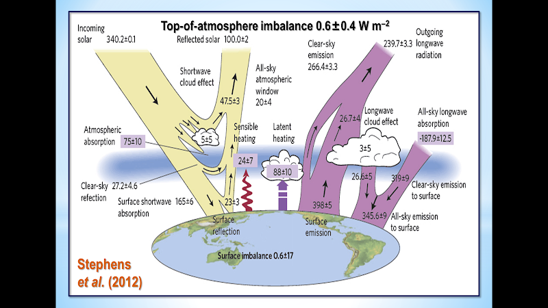
Figure T10. Energy budget diagram for the Earth from Stephens et al. (2012)
In short, most of the forcing predicted by the IPCC is either an exaggeration or has already resulted in whatever temperature change it was going to cause. There is little global warming in the pipeline as a result of our past and present sins of emission.
It is also possible that the IPCC and the models have relentlessly exaggerated climate sensitivity. One recent paper on this question is Monckton of Brenchley et al. (2015), which found climate sensitivity to be in the region of 1 Cº per CO2 doubling (go to scibull.com and click “Most Read Articles”). The paper identified errors in the models’ treatment of temperature feedbacks and their amplification, which account for two-thirds of the equilibrium warming predicted by the IPCC.
Professor Ray Bates gave a paper in Moscow in summer 2015 in which he concluded, based on the analysis by Lindzen & Choi (2009, 2011) (Fig. T10), that temperature feedbacks are net-negative. Accordingly, he supports the conclusion both by Lindzen & Choi (1990) (Fig. T11) and by Spencer & Braswell (2010, 2011) that climate sensitivity is below – and perhaps considerably below – 1 Cº per CO2 doubling.

Figure T11. Reality (center) vs. 11 models. From Lindzen & Choi (2009).
A growing body of reviewed papers find climate sensitivity considerably below the 3 [1.5, 4.5] Cº per CO2 doubling that was first put forward in the Charney Report of 1979 for the U.S. National Academy of Sciences, and is still the IPCC’s best estimate today.
On the evidence to date, therefore, there is no scientific basis for taking any action at all to mitigate CO2 emissions.
Finally, how long will it be before the Freedom Clock (Fig. T11) reaches 20 years without any global warming? If it does, the climate scare will become unsustainable.

Figure T12. The Freedom Clock edges ever closer to 20 years without global warming
Related Links:


52 Responses
Dr Mears speaks in general terms about the “denialists'” datasets, when he knows full well that most references, if not all, have to do with Monckton’s analysis. This permits Mears to talk authoratively about nonsense rather than facts.
WORK AT EXTRAORDINARY HOME REPORT………After earning an average of 19952 Dollars monthly,I’m finally getting 98 Dollars an hour,just working 4-5 hours daily online….It’s time to take some action and you can join it too.It is simple,dedicated and easy way to get rich.Three weeks from now you will wishyou have started today – I promise!….HERE I STARTED-TAKE A LOOK AT…..yt
➤➤➤➤ http://googlestandardaccessonlinemploymentsworks/start/earning/…. ⚛⚛⚛⚛⚛⚛⚛⚛⚛⚛⚛⚛⚛⚛⚛⚛⚛⚛⚛⚛⚛⚛⚛⚛⚛⚛⚛⚛⚛⚛⚛⚛⚛⚛⚛
20 years without warming still won’t end the charade. They still have their hockeysticks. Thanks Marc for the comprehensive look at it, including all the data and especially the methane information is important to know to keep balance on the subject.
You cannot pause that which never existed. The Climate of this planet has always changed and always will.
the fact that it has always changed does not mean we aren’t changing it. It means it’s highly sensitive, and putting mountains of carbon into the atmosphere may not be a good idea.
Nonsense.
Great argument. Supported by zero.
Oh … you mean like your nonsensical argument ?
The earth is not “highly sensitive”.
To think it is, shows a complete ignoring of the evidence.
The evidence for global warming is presented in the article.
Here are some excuses for the temperature to remain steady – no warming.
http://testclimate.wpengine.com/2014/11/20/its-official-there-are-now-66-excuses-for-temp-pause-updated-list-of-66-excuses-for-the-18-26-year-pause-in-global-warming/
Warmest year on record.
warmest year on record !!! ???
ha ha ha ROTFLMAO
The earth has been much warmer, and much cooler than today.
Try some science, instead of your emotional, nonsensical dribble.
Can you name a single scientific org that agrees with you? They all say that it’s the warmest year since record keeping began. None say it isn’t warming. Why? Because it’s warming, moron.
Are you stupid?
You are commenting on an article that just gave you the data.
The world has not warmed in 18 years.
The only idiots who believe in man-made global warming are leftists in the US.
Hello, leftist.
Then why don’t scientists at the Royal Society in London tell everybody there’s no warming? How about the National Academy of Sciences? How about NASA? How about every other org? None of them agree with you, so you must be right. But can we take that chance.? That you’re a genius so there’s nothing to worry about, just dump more mountains of carbon into an unstable atmosphere. God you guys are dumb.
https://en.wikipedia.org/wiki/List_of_scientists_opposing_the_mainstream_scientific_assessment_of_global_warming
http://www.kickthemallout.com/article.php/story-the_petition_project
http://www.wsj.com/articles/SB10001424052702303480304579578462813553136
https://www.nas.org/articles/Estimated_40_Percent_of_Scientists_Doubt_Manmade_Global_Warming
http://www.independent.org/store/book.asp?id=42&s=ga&gclid=Cj0KEQiAhuSzBRDBoZfG56bK9-YBEiQARiPcZWiZXe9HeNL8cplTFCRxiBevUNU1KvN9YJh4jQzv318aAjq-8P8HAQ
http://www.petitionproject.org/
http://www.huffingtonpost.com/2012/04/11/nasa-global-warming-letter-astronauts_n_1418017.html
https://ricochet.com/archives/50-nasa-scientists-against-global-warming/
http://dailycaller.com/2015/06/08/retired-nasa-scientists-warn-pope-against-global-warming-alarmism/
etc.
etc.
etc.
The dummy is in your mirror.
Ok, I looked at the second one and immediately found logical errors. I’ll look at the rest, but that wasn’t a scientific org it was a political websitr. There’s a slight difference.
Nope.
No logical errors.
The error is to think puny humankind can
affect the environment of the entire planet.
That is illogical.
That is the error that you believe.
What is illogical about that? We are having an enormous impact on the planet, to say we are not is loony.
One logical error is to say that these are scientific arguments. They are pure political bs. If you want science, go to scientists.
Nonsense.
Humans cannot effect the planet.
The left, of which you are part, are the ones who use
political BS.
The fact that you believe in man-made global warming
proves it.
The planet has not warmed one degree in 18 years.
There is no man-made global warming.
And yet you keep pushing that BS.
That makes you a liar.
http://www.thenewamerican.com/tech/environment/item/21013-climate-expert-lord-monckton-global-warming-ceased-over-18-years-ago
http://scienceandpublicpolicy.org/monckton/
I can prove to you in hundreds of ways how we have affected the planet. You are the liar. Dangerous shit.
And you are stupid.
Which is more dangerous.
Humans cannot effect the planet.
They do effect small areas, sometimes bad, more often good.
But the entire planet?
Hogwash.
Hogwash is not a scientific or logical argument. You have not made your case.
I made my case all right, and you made yours.
You and your ilk are suicidal.
Kill yourselves if you want to.
Don’t take me with you.
Would you mind googling the issues rather than having your twisted brain further twisted by right wing web sites. The only thing you’ve said that’s true is that the planet has been warmer in the past. But you can’t conclude any of your talking points from that. There’s still global warming due to CO2 emissions
Actually, if you knew anything of science you would know the world has been both warmer and colder in the past.
And you would know the CO2 is a basic building block of life. Needed by all life on this planet. And has been quite a bit higher the past, with no harmful effects. I hate discussing the issues with an ignoramus.
Scientists at the Met Office DID explain to you in 2010:
BBC: Isn’t it true there has been no warming since 1998 and that there has in fact been some slight warming?
PHIL JONES head of CLIMATE RESEARCH UNIT at the Met Office: WORLD DATA GATHERER in CHARGE:
YES I have CALCULATED the TEMPERATURE and there has been NO WARMING since 1998 and some SLIGHT but STATISTICALLY INSIGNIFICANT COOLING. ”
That was your FIRST confession you ignorant hick.
Then came the MET OFFICE’S STATEMENT AFTER THEY FIRED JONES and REVIEWED the DATA
MET OFFICE ANNOUNCEMENT 2013: no WARMING since 1998 or 1997 and SOME SLIGHT COOLING.
http://tinyurl.com/ocfh25t
You ignorant f***g HiCK how could you miss that announcement from YOUR OWN CHURCH?!
All geologists, and historians will tell you the world has been warmer in the past
And yet in FEB 2010 we all saw scammer in chief Phil Jones admit, it hadn’t warmed any at all since 1998, and that in fact it had COOLED a small amount.
That was what we saw him say in an email in 2005: ”The scientific community would come down on e in no uncertaion terms if I said the world cooled since 1 9 9 8. OK IT HAS
but it’s
ONLY SEVEN YEARS of DATA
and it
ISN’T STATISTICALLY SIGNIFICANT.
Looking around what data records do we see depicting that temperature? GO FIGURE, it is the RAW DATA PLACED ONLINE THAT WAY BY LAW,
to STOP ADJUSTMENT FRAUD.
FAST FORWARD: There’s TRENBERTH: there’s JONES: there’s MICHAEL MANN. ”Someone in press said it hasn’t warmed since 1998. What to do?
Not ”Where’d he get THAT from ” Nope. Trenberth: WHAT are we going to DO????!!!!
Mann: YOU issue a PRESS RELEASE stating it hasn’t COOLED it has STEADILY WARMED.
Mann: YOU: you issue one too and DON’T do it so it looks like a copy of HIS.
Mann: and YOU: you have YOUR OFFICE issue one as well. DON’T make it look COORDINATED!”’
Fast forward to a few months FEB 2010 when to KEEP from GOING TO JAIL JONES agreed to CONFESS the REAL
GLOBAL
TEMPERATURE to the ORGANIZATION whose REPORTER he was going to destroy the reputation of just MONTHS earlier.
BBC: ISN’T it TRUE there’s been NO warming since 1998, and that in fact there has been some SLIGHT COOLING?
JONES: YES. I have CALCULATED GLOBAL TEMPERATURE and find there has been
* * * NO WARMING SINCE 1 9 9 8* * *
and that there has been
* * *some SLIGHT but STATISTICALLY INSIGNIFICANT,* * *
C
O
O
L
I
N
G…
That’s Jones’ confession. Have RECORDS been gone back over and those records CORRECTED?
Okay then YOU’RE HERE not REALIZING your church’s HIGH DATA SCAMMER in CHARGE confessed
”i have been faking that data for MORE than TWELVE YEARS. It’s ALL fake there’s been no WARMING.”
Go ahead and answer how this happened and you didnt’ know it. Are you an atmospheric energy/chemist?
Do you have ANY qualifications to monitor what scientists say and come to the correct conclusions?
OBVIOUSLY NOT
I just had to REVEAL to you the HEAD DATA SCAMMER CONFESSED in 2010 ALL those records are fake
HE still got FIRED.
Then, in 2012 the MET OFFICE which FIRED HIM ANYWAY announced their OWN conclusion: NO WARMING SINCE 1 9 9 8
and SLIGHT
but not statistically signficant COOLING.
JUST LIKE
the GLOBAL DATA
placed online RAW by LAW
to STOP the PRIESTHOOD of your MAGIC HEATER IN THE SKY RELIGION’s
DATA
FRAUD
SCAMS.
You’re a f***g hick if you’ve been going around chiding people for ”not understanding” when these CRITICAL developments reveal your church to be a TOTAL and UTTER fraud: STILL ISSUING FRAUDULENT RECORDS.
You need to say something to defend your gross misunderstanding of your church, hillbilly, and it better sound clear as a bell or you’re gonna be in a bind.
Says me.
Not even the climate statists believe that. The talking point “warmest year on record” refers to the temperature record that has actually been recorded by thermometers since the late 1880’s. The media and the leftists know that the useful idiots will understand this talking point to mean “of all time”.
The royal society in London has been keeping temp records since mid 1600’s. Tell them it’s not warming.
“And the resulting history he developed indicates that “summer temperatures during the early Holocene thermal optimum may have been 2.3°C higher than present,” which difference, in Kullman’s words, “corresponds to a general cooling trend of 0.24°C/century, which matches the Milankovitch model of orbitally-driven climate forcing (cf. Berger, 1988; Esper et al., 2012) and indicates that this mechanism has operated as the ultimate driver of climate change throughout the Holocene.”
” And to make this point perfectly clear, Kullman repeats that “the pine tree line (and summer temperature) was consistently higher than present … during the Roman and Medieval periods, c. 1900 and 1000 cal years BP.”
http://www.co2science.org/articles/V16/N50/EDIT.php
wow, this is from a long time ago. look, for most of geologic history there have been high atmospheric CO2 and lot of water covering the land. then the CO2 went into the ground, the water turned to ice sheets, and along came humans and settled the planet. by putting the carbon back in the air, we are releasing the water from the ice sheets. this will cause 2/3s of our land mass to be inundated by oceans.
Red Herring. You posted about temperatures, and I responded in kind, then you dismiss my statement by saying “this is from a long time ago”, even though you were also talking about a long time ago, then you make a completely different point. Your argument’s invalid.
The climate is not highly sensitive. I read we have increased the CO2 (plant food) by only .008%. Probably not much of a mountain compared to the size of the planet. Maybe a mole hill?
Can’t believe people still follow this satire bullshit… -_-
The global warming satirical BS?
I can’t believe the pope bought in to it. Hook, line and sinker
You kids are dumb… -_-
Now, 09.03.15. STUDY SAYS INSANE CEO PAY IS FUELING CLIMATE CHANGE
THERE ARE ANY number of causes for climate change—some natural, some man-made. But a new report by the liberal think tank Institute for Policy Studies points to a distinctly economic cause: greed. According to the report, dramatically rising CEO pay at major fossil fuel companies is also contributing to climate change, because it gives these leaders huge monetary incentives to increase their fossil fuel reserves at any cost.
http://www.wired.com/2015/09/ceo-pay-climate-change/
Except the more reserves there are… the lower the price goes…
So they are failing big time. Your post makes no sense.
They also consume much more, with private jets, yachts, huge houses. The Trump example of frugal living.
The real shut up to this so called debate hinges on the lack of climate sensitivity to the prevailing increases in the naturally occurring atmospheric constituent, the much maligned carbon dioxide. It isn’t necessary to read past the published studies of Lindzen and Choi, Spencer and Broswell. Unless they can invalidate these with hard data, they need to shut up and go home.
Hello Don. I’m not up to speed on those studies. // It isn’t necessary to read past the published studies of Lindzen and Choi, Spencer and Broswell.//
Would you help a person out by posting a link to the studies or how to find them? Thanks. 🙂
The Lindzen and Choi publications referenced in the above article can be viewed at this link: http://wattsupwiththat.com/2011/08/16/new-paper-from-lindzen-and-choi-implies-that-the-models-are-exaggerating-climate-sensitivity/. Spencer and Braswell, again referenced in this article, can be viewed at Dr. Spencer’s website: drroyspencer.com. The former are associated with MIT. The latter with University of Alabama.
Thanks. 🙂
You will all die in the imminent global warming catastrophe.
Can I have $1 billion to study this in detail and make recommendations?
Please look at the NASA Godard center graphs of global mean temps.
“We find compelling evidence that recent claims of a “hiatus” in global
warming lack sound scientific basis. Our analysis reveals that there is
no hiatus in the increase in the global mean temperature, no
statistically significant difference in trends, no stalling of the
global mean temperature, and no change in year-to-year temperature
increases.”
http://link.springer.com/article/10.1007/s10584-015-1495-y
Forgive the fact that I am a newcomer here. I have always read that the climate “community” originally represented that the satellite data would be the gold standard for monitoring AGW. Then, the skeptics said that the satellite data shows the pause in warming (e.g. this article by Lord Monckton). I skimmed the Wikipedia article on the satellite data and it unsurpisingly says that the satellite data confirms AGW predicted by the models with a little divergence.
Can someone explain the AGW proponents’ claim that the satellite data supposedly confirms global warming theory?
Can someone explain the AGW proponents’ claim that the satellite data supposedly confirms global warming theory?
Because the satellites show warming? Is this a trick question?
Best,
D https://uploads.disquscdn.com/images/182c7c526aab159d16be77294b67de0813033c7f42a312f61fa2693ecdfa3fef.png