
By Christopher Monckton of Brenchley — Special to Climate Depot
Global Temperature Update
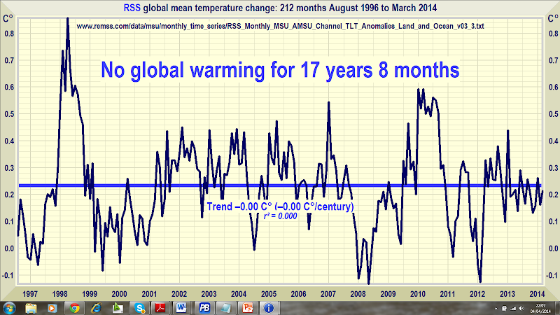
No global warming at all for 17 years 8 months
Global warming? What global warming? According to the RSS satellite data, whose value for March 2014 is just in, the global warming trend in the 17 years 8 months since August 1996 is zero. The 212 months without global warming represents just over half the 423-month satellite data record, which began in January 1979.
Dataset of datasets. The mean of the GISS, HadCRUt4, NCDC, RSS, and UAH monthly global mean surface or lower-troposphere temperature anomalies shows no global warming statistically distinguishable from zero over the 18 full years from March 1996 to February 2014. The 0.14 Cº trend over the 18-year period is within the ±0.15 Cº combined measurement, coverage, and bias uncertainties in the datasets. There may have been no global warming at all during the entire lifetimes of all students now in high school. Not that their teachers will have told them that.
The 18-year and centennial-equivalent warming trends on each of the five key datasets are:
|
Dataset |
18 years |
100 years |
|
GISS |
0.18 Cº |
0.98 Cº |
|
HadCRUT4 |
0.14 Cº |
0.80 Cº |
|
NCDC |
0.14 Cº |
0.75 Cº |
|
RSS satellite |
0.03 Cº |
0.16 Cº |
|
UAH satellite |
0.21 Cº |
1.17 Cº |
|
3 terrestrial |
0.15 Cº |
0.85 Cº |
|
2 satellite |
0.12 Cº |
0.66 Cº |
|
All 5 datasets |
0.14 Cº |
0.77 Cº |
Key facts about global temperature
- The RSS satellite dataset shows no global warming at all for 212 months from August 19996 to March 2014. That is just over half the entire 423-month satellite record.
- The fastest centennial warming rate was in Central England from 1663-1762, at 0.9 Cº per century – before the industrial revolution began. It cannot have been our fault.
- The global warming trend since 1900 is equivalent to 0.8 Cº per century. This is well within natural variability and may not have much to do with us.
- The fastest warming trend lasting ten years or more occurred over the 40 years from 1694-1733 in Central England. It was equivalent to 4.3 Cº per century.
- Since 1950, when a human influence on global temperature first became theoretically possible, the global warming trend is equivalent to 1.2 Cº per century.
- The fastest warming rate lasting ten years or more since 1950 occurred over the 33 years from 1974 to 2006. It was equivalent to 2.0 Cº per century.
- In 1990, the IPCC’s mid-range prediction of the near-term warming trend was equivalent to 3.5 Cº per century.
- The global warming trend since 1990, when the IPCC wrote its first report, is equivalent to 1.4 Cº per century – two-fifths of what the IPCC had then predicted.
- In 2013 the IPCC’s new mid-range prediction of the near-term warming trend was for warming at a rate equivalent to 1.7 Cº per century – just half its 1990 prediction.
- Though the IPCC has cut its near-term warming prediction, it has not cut its centennial warming prediction of 3.7 Cº warming to 2100 on business as usual.
- The IPCC’s prediction of 3.7 Cº warming by 2100 is more than twice the greatest rate of warming lasting more than ten years that has been measured since 1950.
- The IPCC’s 3.7 Cº-by-2100 prediction is more than three times the observed real-world warming trend since we might in theory have begun influencing it in 1950.
- Since 1 January 2001, the dawn of the new millennium, the warming trend on the dataset of datasets is zero – 0.0 Cº per century. No warming for 13 years 2 months.
- Recent extreme weather cannot be blamed on global warming, because there has not been any global warming. It is as simple as that.
- RSS shows the least warming over the past 18 years; UAH, the other satellite dataset, shows the most. The difference is caused by varying adjustments to the data.
- Averaging the RSS and UAH data, and averaging the GISS, HadCRUT4 and NCDC data, shows a difference of only 1/30 Cº between the two trends.
Technical note
Our latest topical graph shows the RSS dataset for the 212 months August 1996 to March 2014 – just over half the 423-months satellite record.
Terrestrial temperatures are measured by thermometers. Thermometers correctly sited in rural areas away from manmade heat sources show warming rates appreciably below those that are published. The satellite datasets are based on measurements made by the most accurate thermometers available – platinum resistance thermometers, which not only measure temperature at various altitudes above the Earth’s surface via microwave sounding units but also constantly calibrate themselves by measuring via spaceward mirrors the known temperature of the cosmic background radiation, which is 1% of the freezing point of water, or just 2.73 degrees above absolute zero. It was by measuring minuscule variations in the cosmic background radiation that the NASA anisotropy probe determined the age of the Universe: 13.82 billion years.
The graph is accurate. The data are lifted monthly straight from the websites maintained by the keepers of the datasets. A computer algorithm reads them down from the text file, takes their mean and plots them automatically using an advanced routine that automatically adjusts the aspect ratio of the data window at both axes so as to show the data at maximum scale, for clarity.
The latest monthly data point is visually inspected to ensure that it has been correctly positioned. The light blue trend line plotted across the dark blue spline-curve that shows the actual data is determined by the method of least-squares linear regression, which calculates the y-intercept and slope of the line via two well-established and functionally identical equations that are compared with one another to ensure no discrepancy between them. The IPCC and most other agencies use linear regression to determine global temperature trends. Interestingly, Professor Phil Jones of the University of East Anglia recommends it in one of the Climategate emails.
Dr Stephen Farish, Professor of Epidemiological Statistics at the University of Melbourne, kindly verified the reliability of the algorithm that determines the trend on the graph and the correlation coefficient, which is very low because the data are highly variable and the trend is flat.
Related Links:
Climate Depot Analysis: ‘There have been at least nine ten separate explanations for the standstill in global warming’ – 1) Low Solar Activity; 2) Oceans Ate Warming; 3) Chinese Coal Use; 4) Montreal Protocol; 5) Readjusted past temps to claim ‘pause’ never existed 6) Volcanoes 7) Decline in Water Vapor 8) Pacific Trade Winds 9) ’Stadium Waves’ 10) ‘Coincidence’


27 Responses
I thought Lord Monckton just had an web article on WUWT stating that the RSS has been flat for 17 years 6 months. How did that change to 17 years 8 months in just a couple of days?
And the 2 months is going to make a difference to the numbers how?
No big difference. I just wondered how it changed 2 months in one week. I think part of the reason is that the RSS for March just came out. The 17 years 6 months statement I saw was from before the March data came out. No, I am not a climate scientist. One has to make that statement to prove one is not an idiot these days.
they go as far back as possible to get the longest period with zero slope. a new month on the front end and another month on the back end equals two more months. check the start dates on the graphs.
That’s because the flat period is as long as it is.
That 17years and 6months has been kept 17years and 6 months for a few months now. I have been wondering why hasn’t that 17yrs and 6 months have not been incremented! So it is very easy to understand 17 years and 6 months PLUS 2 months more of no global warming EQUALS 17 years and 8 months. And, if it goes on like this for another 1 month off no global warming, you then have 17 years 8 months PLUS 1 month EQUAL 17 years and 9 months, just thought to add that in, just in case if you have trouble again in month from now.
I just wonder if this is another reason why the GW crowd not only can’t do science, but they can’t do basic addition either. Its no wonder why there are so many bad scientists around these days.
Another thought just came to me:
What do Global Warming scientists get when they add 1 and 1 together?
Well this problematic….for things are not so straight forward with the Twilight Zone Warmists. You see, when these people see 1 + 1 in practice, lets say 1° + 1° (that is 1 degree plus 1 degree Celsius), they don’t see it as two equal scalars added together. Addition is temporally weighted! You see it works like this, mind you I’m no psycho-analyst or head-shrinker, I’m just your run-of-the-mill physicist who knows only about things like thermodynamics and meaningless things like field-theory, so I am really out of speciality here, but it does appear from the way they do all their papers, that the earlier recorded data reading of say 1° (it may well be really something like 23° but lets keep the issue simple here for we are talking about hefty numbers here when we say something like 23°, so 1° should be simplistic enough for all of us to understand), and if this data reading was recorded earlier in time, would have lesser, or since this is the first data reading no weighted component on it. But when you have to add another, later, 1° to the first read 1°, ah! now this 1° is NOT REALLY 1° degree, it has to be….hmm…. these GW people have to do some sort of processing on it …. i forget the term but it goes something like…homogenization, harmonization, habitualization, hackneyedation or is it hospitalization?…hmm something like that… anyway, that second 1° is really something like 1.4°! You get it? Because that second 1° is newer than that first older reading, it has to be better! no…get it now? You can’t have that 1° done today, with proper more modern equipment read by greater more educated ̶i̶̶d̶̶i̶̶o̶̶t̶̶s̶ scientists, being just 1°, it has to be something like 1.4°! So for Global Warming Scientists do addition as follows:
1° (say in 1980) + 1° (say in 2014) = 1° + 1.4° = 2.4° so the average temperature rise is 2.4°/2 = 1.2°. You have global warming! Now, to do the Global Warming Scientists fairness, I have yet figured out how their averaging works out, it may very will be not, like this example, just 2, but 1.9 or 1.8. It is too difficult for me, a plain physicists to figure it out, just yet, but I’m working on it!
Anyway that’s how math works with in the Twilight Zone, where the Global Warming Scientists work.
Hope this helped out for you more normal, that is, those who don’t need a head-shrinker, to do their math.
Cheers!
uhhh, you’re a physicists, are you? all of you?
new month, more data
It’s simple. He’s taking the longest period that the satellite data shows zero trend. As temperatures continue to flat-line and/or decrease, the time will increase on BOTH ends.
It’s simple. He’s taking the longest period that the satellite data shows zero trend. As temperatures continue to flat-line and/or decrease, the time will increase on BOTH ends.
This is the second time I’ve warned about this graph. Try liking it on Facebook. When you see the graph ready to post to your Facebook account, it looks entirely different, with a very sharp upturn over the last 1/3 of the chart (or so). So, somehow the version shown here is the opposite of what shows up when you try to post it. The authors need to resolve this problem.
That’s just because Facebook uses a thumbnail, which has a different aspect ratio. That’s not the fault of the post authors.
Thanks. Taking a closer look I see that FB shows up to 2010. What a different picture you get with that truncation. Any science that looks settled until an additional 3 years of data is considered probably needs just a bit more refinement, eh?
Yet except for the RSS data, temperatures still appear to have been rising since the beginning of the century. Only the RSS data shows a flat trend in that interval. Because RSS seems to depart from the other datasets, I would be interested in a similar analysis using, say the UAH data for this century.
I guess that’s because RSS doesn’t have the same UHI contribution as surface stations, at least I would expect that to be part of the reason. However even the surface station data is not statistically significant.
How do you get the site to print out this graph?
You can try plotting the data yourself:
http://www.woodfortrees.org/plot/gistemp/from:1999/plot/gistemp/from:1999/trend
Incidentally most ways that you do it still show a clear WARMING for the past 15 years..
I did. They all show no warming for the last decade or so, except the UAH. Most show current cooling. I think you need to advance beyond linear regression otherwise your models will not cope with the concepts of
“peak” and “trough”. http://i39.tinypic.com/ifu0qt.png
People, you really need to learn more about the huge problems with using satellites to take the atmosphere’s temperature:
http://en.wikipedia.org/wiki/UAH_satellite_temperature_dataset
The UAH & RSS people have made fools of themselves consistently over the last 2 decades.
Certainly you have some idea about orbital decay of satellites?
Orbital decay is one of many factors. This deceptive POS web author waxes eloquently about the accuracy of the Pt thermometer on the satellite, but declines to mention that their huge errors have largely been due to the calculations trying to convert atmospheric radiance into actual temperatures. Their errors have been worse than those at the IPCC.
While you are beginning to learn some basic science, keep in mind that most of the atmosphere’s mass and therefore heat storage capacity is in the troposphere. Don’t get too excited about stratospheric trends.
Speaking of fools, the correlation coefficient (r2) was 0.000 on the graph that you and the web page were so proud of. That means the line was meaningless and any other line drawn would fit the data just
as well or better. But the data was satellite data which has many problems. Plus the satellite people generally recognize a warming trend now.
This web page is a classic example of the dogsh*t on the internet that cleverly fools ordinary people and willfully ignorant people that visit this site.
The atmosphere is warming; get over it. And the oceans are storing a prodigious amount of heat.
Your only remaining line of defense is to claim it’s all natural, which is BS-Obfuscation!
Just wait till the sand your heads are in gets real warm or saturated by rising oceans, only then will you look into your children’s eyes and say we were stupid and had some other motive.
Toodles
I read the Wikipedia piece. It said corrections have been made. What’s the problem?
The r-square means that there is precisely no trend. That’s what the author is showing. You obviously don’t understand statistics if you think that the r-square means that the author’s conclusions are wrong.
The r-square means that there is precisely no trend. That’s what the author is showing. You obviously don’t understand statistics if you think that the r-square means that the author’s conclusions are wrong.
The RSS satellite data is lower trop so go rewrite your piece and get back to us next year.
F
are you people fucking stupid? this data is differenced “mean temperature change”, of course it has no trend! stack it up and you’ll see one!
(sigh) No. Mean temperature change from the start month, not from the last month.
I believe we are seeing climate change, however I do not believe it is human induced. Human exacerbated maybe, but not induced. I also believe there is nothing we can do to stop it from happening. We may be able to slow it down a bit, but cannot stop it. We should be doing more to have a plan on how to deal with the planet’s climate changes.
On top of that, a handful of nations passing climate laws and greenhouse gas restrictions will do nothing to slow down, yet alone prevent climate change, even if it is caused by humans. The air is not stagnate over any particular country, it travels around the globe so any restrictions need to be implemented around the world to have a rat’s chance in hell of working.
Another thing, any ‘climate’ bill that any country can initiate and that institutes ‘fines’ for going over a certain greenhouse gas release, will need to be sure that manufacturers cannot pass the cost of ‘green’ technology onto the consumer. For example the previous, defunct US Cap & Trade bill did not do this and also ‘fined’ the consumer for not lowering their individual greenhouse gas usage. Thus if the bill had passed the government would have collected fines from the manufacturer of the product AND the consumer who didn’t have a ‘greener’ product to use in its place.