
BUSTED: Claim of Greenland Warmest Temperature Record of 75°F Challenged By Data
https://notalotofpeopleknowthat.wordpress.com/2016/06/17/theres-joe-romm-and-then-theres-the-facts/
By Paul Homewood

http://thinkprogress.org/climate/2016/06/15/3788651/greenland-record-globe-hottest-year/
Joe Romm has been up to his tricks again:
Last Thursday, Greenland’s capital hit 75°F, which was hotter than New York City. This was the highest temperature ever recorded there in June — in a country covered with enough ice to raise sea levels more than 20 feet.
It comes hot on the heels of the hottest May on record for the entire globe, according to NASA. As the map above shows, May temperature anomalies in parts of the Arctic and Antarctic were as high as 17°F (9.4°C) above the 1951-1980 average for the month.
Greenland in particular has been shockingly warm this spring. Here, for instance, is “land surface temperatures for April 2016 compared to the 2001–2010 average for the same month” from NASA:

NASA reports that some parts of Greenland were 36°F (20°C) warmer than “normal” — and remember, in this map, the new “normal” is the 2001–2010 average, which means it already includes a century of human-caused warming.
http://thinkprogress.org/climate/2016/06/15/3788651/greenland-record-globe-hottest-year/
Romm’s ploy is straightforward:
- Temperatures of 75F must be unheard of in a place like Greenland.
- Ice sheets will surely melt quickly in such temperatures.
He reinforces his message like this:
Some might note a worrisome pattern, driven by ever-rising levels of heat-trapping carbon dioxide.
Joe gets his “record temperature” from the highly reliable Weather Underground. However, their weather records show maximum temperatures bouncing up and down during that day. Somehow, we are expected to believe that the temperature jumped up several degrees at ten to every hour!

It is evident that there are two recording stations at Nuuk. No serious meteorologist would declare a record just based on one, when the other was so much different.
In any event, 75F (23.9C) is not even a record. According to DMI, the highest temperature recorded at Nuuk was 24.2C, back in July 1908.
As for his ridiculous map, supposedly showing Greenland temperatures 20C warmer than normal in April, it presumably has not occurred to him that there ARE NO WEATHER STATIONS IN THE INTERIOR OF GREENLAND.
The map comes from satellite observations from NASA, who comment:
This temperature anomaly map is based on data from the Moderate Resolution Imaging Spectroradiometer (MODIS) on NASA’s Terra satellite. Observed by satellites uniformly around the world, land surface temperatures (LSTs) are not the same as air temperatures. Instead, they reflect the heating of the …
UN weather agency warns of more ‘global warming’ in May
The U.N. weather agency is warning of “fundamental change” afoot in the global climate and continued warming, accompanied recently by unusually high rainfall in parts of the US and Europe.
The World Meteorological Organization was pointing Tuesday to data released by NASA a day earlier showing that this May was the hottest on record, and the Northern Hemisphere spring has been the hottest spring ever.
WMO global climate director Dr. David Carlson said the new data showed 370 straight months of warm or warmer-than-average temperatures worldwide. WMO said the recentEl Nino was only partly to blame for the recent temperature rise.
The agency noted that heat has been particularly high in the Arctic, and has caused an early onset of the annual melting of Arctic sea ice.…
Alaska Has Record Warm Spring, Following The Second Warmest Winter On Record
Alaska Has Record Warm Spring, Following The Second Warmest Winter On Record
It looks like late June or early July right now
— gReader Pro…
Study: Heat Kills 9,000 in USA and Cold Kills 144,000
Via: http://sunshinehours.net/2016/04/07/usa-heat-kills-9000-and-cold-kills-144000/
USA: Heat Kills 9,000 and Cold Kills 144,000
Global warming saves lives! Cold kills way more people than heat does.
Gradually rising temperatures across decades will increase the number of hot days and heat waves. If humans make no attempts whatsoever to adapt—a curious assumption that the report inexplicably relies on almost throughout—the total number of heat-related deaths will rise. But correspondingly, climate change will also reduce the number of cold days and cold spells. That will cut the total number of cold-related deaths.
Consider a rigorous study published last year in the journal Lancet that examined temperature-related mortality around the globe. The researchers looked at data on more than 74 million deaths in 384 locations across 13 areas: cold countries like Canada and Sweden, temperate nations like Spain, South Korea and Australia, and subtropical and tropical ones like Brazil and Thailand.
The Lancet researchers found that about 0.5%—half a percent—of all deaths are associated with heat, not only from acute problems like heat stroke, but also increased mortality from cardiac events and dehydration.
But more than 7% of deaths are related to cold—counting hypothermia, as well as increased blood pressure and risk of heart attack that results when the body restricts blood flow in response to frigid temperatures.
In the U.S. about 9,000 people die from heat each year but 144,000 die from cold.
A 2009 paper from the European Union expects that the reduction in cold deaths will definitely outweigh extra heat deaths in the 2020s. Even near the end of the century, in the 2080s, the EU study projects an increase in heat deaths of “between 60,000 and 165,000” and a decrease of cold deaths of “between 60,000 and 250,000.” In other words, the effects will probably balance each other out, but warming could save as many as 85,000 lives each year.
An academic paper published two years ago in Environmental Health Perspectives similarly shows that global warming will lead to a net reduction in deaths in both the U.K. and Australia. In England and Wales today, the authors write, statistics show that heat kills 1,500 people and cold kills 32,000. In the 2080s, they calculate that increased heat will kill an additional 3,500. But they find that cold deaths will drop by 10,000. In Australia the projections suggest 700 more heat deaths but 1,600 fewer
Climate numerology! Man-made CO2 caused heatwaves in 1930s,’40s, ’80s and ’90s
Climate numerology! Man-made CO2 caused heatwaves in 1930s,’40s, ’80s and ’90s
How convenient?! A new study shows that human influence on the climate started just before the major (and unerasable) heatwaves of the late 1930s, thus wrapping those awkward years under the banner of Man Made Climate. This study provides the handy peer reviewed link-bomb “answer” to that. The inexplicable heat of the 1930s and 40s has been a constant source of pain for Global Worriers. Skeptics can point out that the decadal rate of warming was pretty much the same back then, even though CO2 was at the ideal, clima-perfecto level, of 310ppm. How could it be that massive 400ppm of CO2 was barely able to break the heat records set when CO2 was almost 25% lower? Well, finally, mystery solved. A new Australian study compares models that don’t-explain-the-climate with CO2, to ones that-don’t-explain-the-climate without CO2. These models assume CO2 causes warming, so when they take out the CO2 factor that was added in to produce “the climate”, the models prove, ipso gloriousi, that CO2 causes warming. Indeed their method is so good, it can’t fail. As Anthony Watts says “it seems clear to me that the conclusion existed before the paper was written.” Quite. Say hello to Climate Numerology […]Rating: 0.0/10 (0 votes cast)
— gReader Pro…
Watch: Climatologist Dr. John Christy to Congress: NOAA data shows downward trend of extreme high temps since 1930s
Testifying before Congress, atmospheric scientist Dr John Christy illustrates that NOAA’s own data clearly shows that many more 100 degree days occurred in the 1930’s than today.
Dr. Christy: “When you look at the United States record of extreme high temperatures you do not see an upward trend at all. In fact, it’s slightly downward. That does fly in the face of climate model projections.”
Paris Climate Promise: A Bad Deal For America
US House Committee on Science, Space, and Technology
February 2, 2016
Christy’s full testimony here.
Related Links:
EPA Say Heatwaves Much Worse in 1930’s: ‘Heat waves occurred with high frequency in the 1930s, and these remain the most severe heat waves in the U.S. historical record’ – ‘What is surprising is that the EPA acknowledged that the 1930’s saw much more severe heat waves and that there is no trend to heat waves becoming worse’

Climatologist Dr. John Christy Debunks NOAA’s Climate Claims at Cong. Hearing – Defends Satellites
Cong. Lamar Smith: Paris UN Climate Agreement a Bad Deal for Americans
…Smoking gun graph reveals NASA’s Hansen’s research showed Medieval Warm Period warmer than today – 1990 UN IPCC report used Hansen’s 1981 study
Via: http://realclimatescience.com/2016/01/hansen-confirmed-the-mwp-in-1981/
“Climate fraudsters frequently claim that the 1990 IPCC temperature graph below showing the Medieval Warm Period (MWP) was only a representation of Central England Temperatures (CET) and was not global.”
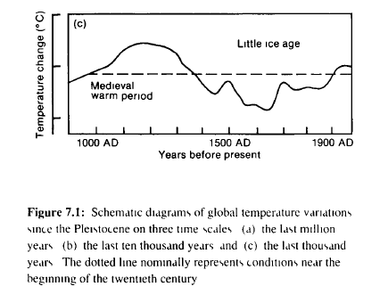
This is nonsense. The graph was derived from James Hansen’s 1981 study, which was taken from temperatures in England, California and Greenland.
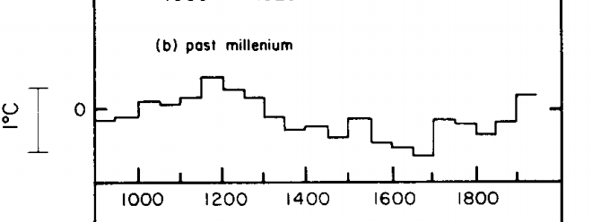
(b) is based on temperatures in central England, the tree limit in the White Mountains of California, and oxygen isotope measurements in the Greenland ice (W. Dansgaard of the Geophysical Isotope Laboratory, University of Copenhagen, pers. comm.), with the temperature scale set by the variations in the last 100 years
The overlay below shows that the 1990 IPCC graph is essentially the same graph as Hansen 1981.
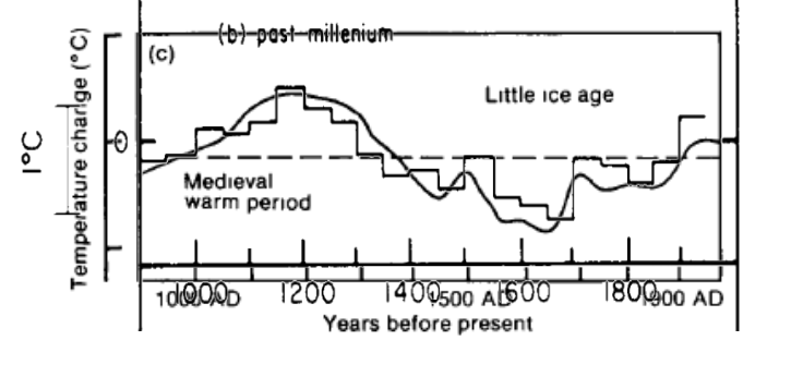
The MWP was real.
Flashback: UN Scientist urged: ‘We have to get rid of the Medieval Warm Period’
#
Related Links:
‘More than 700 scientists from 400 institutions in 40 countries have contributed peer-reviewed papers providing evidence that the Medieval Warm Period was real, global, & warmer than the present’ – Climate Depot’s Medieval Warm Period Round Up of Studies
Check out latest MWP map here.
Roman and Medieval Warm Periods vs. the Current Warm Period – Studies ‘clearly demonstrating that there has been nothing unusual or unprecedented about the mean level of global warmth experienced over the past 18 years of no significant upward or downward trend.’
More Glacier Studies Confirm Roman And Medieval Warm Periods Were Just As Warm As Today
05 Oct 1950 – Weather Theory Debunked History Gives Lie To Cycles
Alpine Glaciers Were Of Similar Size During Medieval Warm Period, New Study Finds – A new paper published in The Cryosphere reconstructs Alpine glacier fluctuations over the past 1600 years and finds glacier lengths of 7 Alpine glaciers were similar during the Medieval Warm Period and the end
CBS Hypes Earth’s ‘Chronic Fever’ in Extreme Weather Segment
Journalistic Fraud: North Pole Region Saw Similar Warm Spikes Before…OVER 70 TIMES In Last 58 Years!
Only a fraction of the Arctic saw a large warm spike
The reality is that weather charts showed that only a minority fraction of the Arctic had briefly reached the melting temperature, while the vast remainder was stuck at its usual 25 – 40°C below zero.
According to the Danish Meteorological Institute here, which has been systematically tracking Arctic temperatures north of 80° latitude since 1958, here’s what the 2015 “North Pole meltdown” really looked like (far right) once the whole Arctic region got factored in:
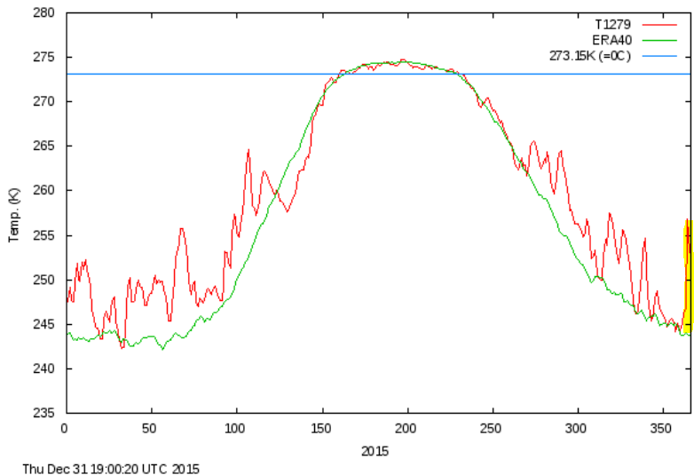
Chart: DMI.
The above figure shows that the temperature in the Arctic above 80°N was estimated to have risen only some 13°K during the event, and not 30°K as the WAPO tried having its readers think.
The fact is that only a small region near the North Pole saw a burst of warm southern air – lasting a few hours. The rest of the Arctic remained in it’s usual ice box. Almost immediately, temperatures at the North Pole position dropped back to -30°C.
Has a 13°K spike happened before?
Is it something weird and totally unusual that we need to worry about? Going back and looking at the DMI charts, we find that temperature spikes in the Arctic for the period early November to late March are nothing new.
For example a look at the year 1959, the chart below shows that a similar temperature spike occurred not just once, but twice! (marked yellow).
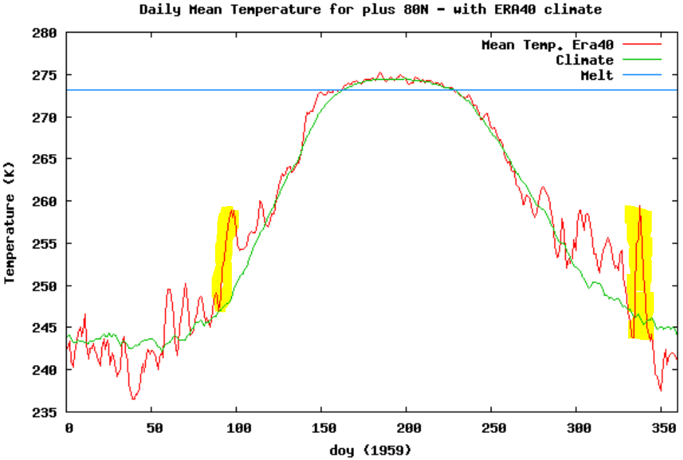
Chart: DMI.
And examining all the years since 1958 we see that a temperature spike of some 12°K or more in a matter of a few days during the November – March deep winter period occurred more than 70 times!
In fact fluctuations of 10°K (i.e. similar to what just happened) are actually the norm for the North Pole region.
Also taking a look at the wild fluctuations seen in 1964, 1984, or 1990 – back when CO2 was at levels near the “safe” 350 ppm – we see they were far more extreme.
– See more at: http://notrickszone.com/2016/01/04/journalistic-fraud-north-pole-region-saw-similar-warm-spikes-before-over-70-times-in-last-58-years/#sthash.pjk3VsBf.dpuf…