
Hottest year? ‘They don’t tell you how much warmer it actually was. If they did, myth would be exposed immediately’
Bryan Leyland: Things you know that ain’t so – 2016 was the warmest year
Labels: Bryan Leyland, Global Warming
“Things you know that ain’t so – 2016 was the warmest recorded year: global warming is real and dangerous”.
Or so they tell you. But you when you examine the facts, you come to the opposite conclusion. It is a classic example of using half-truths to mislead.
They don’t tell you how much warmer it actually was. If they did, the myth would be exposed immediately.
The amount of warming depends on which of the five recognised temperature records you use.
If you believe the satellite records – that NASA says are the most accurate – the warming since 1998 is between 0.02° and 0.04° – 0.1° to 0.2° per century. Statistically, it provides no evidence of warming of any sort.
The other measurements are the surface temperature records that have very poor surface coverage – virtually nothing over the ocean and huge areas of the earth – and have been systematically “adjusted” over the years to exaggerate the warming over the last hundred years or so. For instance, according to the GISS 2008 temperature record, the world warmed by 0.45° between 1910 and 2000. By January 2017, the GISS records showed that the warming for the same period had increased to 0.75°. Remarkable!
According to the satellites, the 2016 El Niño was not much hotter than that of 1998 but the surface temperature records indicate a more rapid rate of warming. But there is a big problem with this. El Niño events are natural and unpredictable and, because they are isolated events, they are unrelated to increasing carbon dioxide concentrations that would lead to a steady temperature rise. Measuring from the 1998 peak temperature to 2016 peak temperature gives a much more rapid rate of warming than measuring the average temperature trend over the period. So they use the temperature peaks. Putting it another way, if the 2016 El Nino had been cooler than that of 1998, would they have told us that it heralds global cooling? I think not.
The plain fact is that although the computer models predicted 0.5° temperature rise during the last 18 years the records show that world has not warmed in any statistically significant sense. Even the surface temperature records show a warming of 0.2° over that period. According to the IPCC, half …
Seeing Red—New NASA Climate Change Video Uses Questionable ‘Data’ for Colorful Deception
A visitor to Cornwall Alliance’s Facebook page recently asked our thoughts on a new video from NASA purporting to demonstrate that global warming is happening rapidly and that there’s been no slow-down, let alone “pause,” in the last two decades. Among other media, Huffington Post featured the video in an article titled “NASA Climate Change Video Shows Just How Quickly the Earth Is Warming.”
As is typical, the video uses frightening graphics to communicate numbers that are far less than frightening:
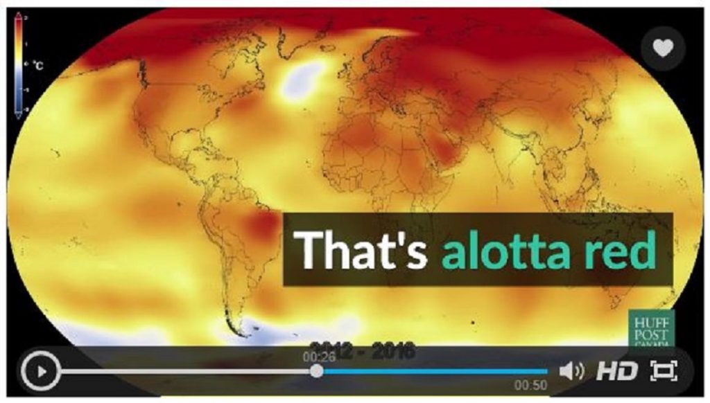
Of course, we’re all accustomed to seeing redness on severe burns and on hot stove burners and oven heating elements. Red means hot-hot-hot! Little does the typical viewer recognize that the entire increase in global average temperature over the period from 1880 to the present is estimated at roughly 1C—a small fraction of the typical difference between low and high readings on a single day in most locations, and a much smaller fraction of the typical difference between winter low and summer high in most locations. Consider what happens to the psychological effect if the picture is rendered in grayscale instead of the shocking reds and yellows:
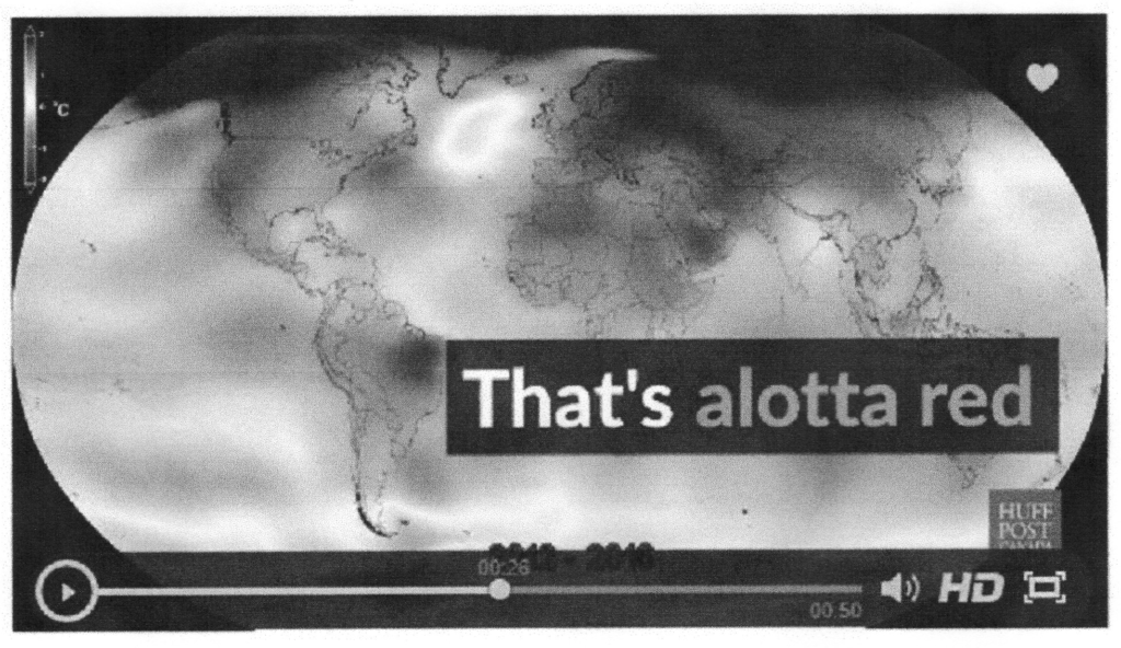
There’s a lesson in how graphics can be used for psychological manipulation.
The video of course only pictures the numbers fed into it, and the “adjustments” being made over the last three years or more by both NOAA and NASA to their surface temperature “data” are highly suspect because the criteria by which they’re made, the computer codes that apply the criteria, and the whole path of the adjustment process have not been made public and thus aren’t testable/replicable by other scientists. Replicability is the hallmark of sound scientific research. The actual outcome of the adjustments is clear, though: “temperatures” in the early overall period are pushed downward, and “temperatures” in the later part are pushed upward.…
UN IPCC ‘altered’ climate reports violate U.S. science policy guidelines
U.S. Scientific Integrity Rules Repudiate the UN Climate Process
By Canadian journalist Donna Laframboise, author of the book, The Delinquent Teenager Who Was Mistaken for the World’s Top Climate Expert.
Mere days before he left office, Barack Obama’s Department of Energy (DOE) introduced a sweeping new scientific integrity policy. This matters because the DOE is the largest funder of physical sciences in America, and because climate change is one of its core concerns.
Elsewhere, I’ve explained that the new policy is a startling departure from the one that prevailed while Obama was in charge. It seems designed to unleash mayhem. In both instances, however, the DOE was adamant concerning one issue: Politicians should not tamper with scientific findings.
The 2014 DOE policy declares:
Political officials will not suppress or alter scientific or technological findings. [italics added]
The 2017 DOE policy says:
Under no circumstance may anyone, including a public affairs officer, ask or direct any researcher to alter the record of scientific findings or conclusions. [italics added]
…personnel will not suppress or alter scientific or technological findings, or intimidate or coerce…others to alter or censor scientific or technological findings or conclusions.
There’s nothing equivocal about these statements. When scientists produce a document that says one thing, but their findings get massaged and manipulated by the people upstairs, scientific integrity has been violated. That is the clear position of the US government.
I am therefore happy to report that this same government has, in no uncertain terms, repudiated the process by which UN climate reports are produced.
In recent years, I’ve written two entire books about the Intergovernmental Panel on Climate Change (IPCC). Tasked with producing authoritative climate change assessments, the IPCC recruits scientists to write these documents.
The last major scientific assessment, released in 2013-2014, runs to 7,000 pages. No one has time to read such an opus, so the IPCC also released a Summary for Policymakers approximately 30 pages long for each of the report’s three sections.
These summaries were authored by a subset of the scientists who worked on the main report. But the IPCC considers scientists’ own, unadorned words to be a mere draft. Before each summary became an official IPCC document it was extensively altered. By political officials.
 IPCC summary-rewriting meeting. Click to enlarge. Photo credit: http://www.flickr.com/photos/ipccphoto/14108451053/ Image used here in a fair use context. More info here.
This …
Analysis: NASA: If The Trend Is Going The Wrong Way, Simply Change The Data
In 1999, NASA’s James Hansen was troubled that his global warming theory was failing and the US was cooling.
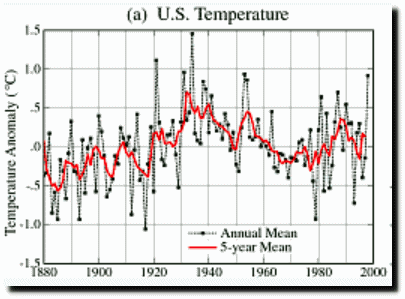
Whither U.S. Climate?
Empirical evidence does not lend much support to the notion that climate is headed precipitately toward more extreme heat and drought. The drought of 1999 covered a smaller area than the 1988 drought, when the Mississippi almost dried up. And 1988 was a temporary inconvenience as compared with repeated droughts during the 1930s “Dust Bowl” that caused an exodus from the prairies, as chronicled in Steinbeck’s “Grapes of Wrath”
in the U.S. there has been little temperature change in the past 50 years, the time of rapidly increasing greenhouse gases — in fact, there was a slight cooling throughout much of the country
NASA GISS: Science Briefs: Whither U.S. Climate?
Troublesome data is no problem for NASA. They simply alter the data to produce the result they want, and then scream that they are being harassed when called out for their fraud.
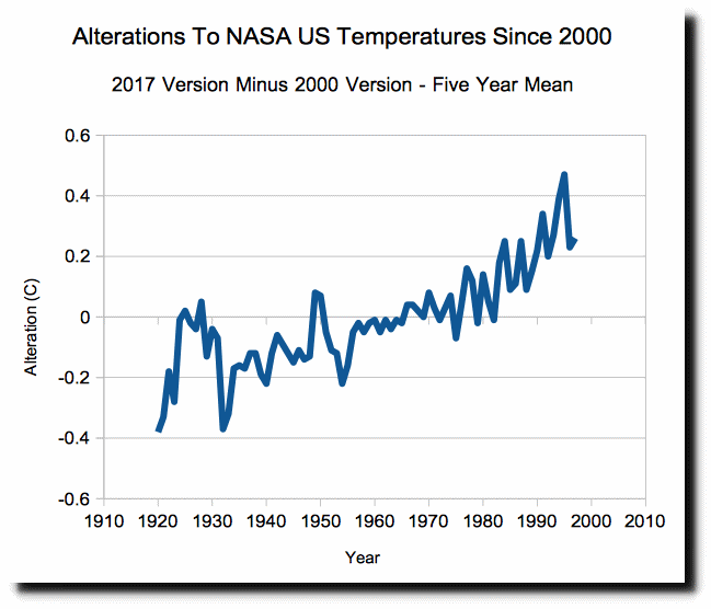
2000 Version archived by John Daly 2017 Version
In cooperation with NOAA, NASA simply cooled the past to make the post-1930 cooling go away.
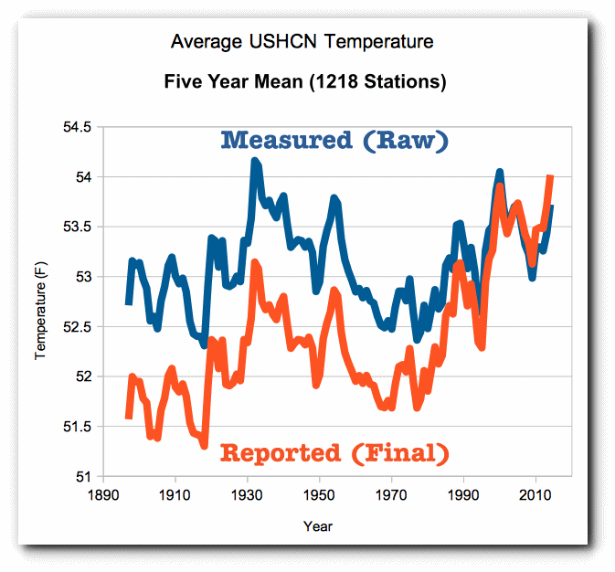
NOAA knows perfectly well that the US is not warming.
U.S. Data Since 1895 Fail To Show Warming Trend – NYTimes.com
Bias, ignorance and reality in climate science
ANALYSIS/OPINION:
The rains have returned to California, and the six-year drought appears to be largely over. We have heard countless assertions from journalists and politicians, ignorant of the weather history of California and the other western states, that the drought was a result of global warming.
In the January edition of Scientific American, there is a well-told story “California Megaflood: Lessons from a Forgotten Catastrophe” by B. Lynn Ingram, a professor of earth and planetary science at the University of California, Berkley. She notes: “Geologic evidence shows that truly massive floods, caused by rainfall alone, have occurred in California every 100 to 200 years. The only megaflood to strike the American West in recent history occurred during the winter of 1861-62. California bore the brunt of the damage. This disaster turned enormous regions of the state into inland seas for months, and took thousands of human lives. The costs were devastating: One quarter of California’s economy was destroyed, forcing the state into bankruptcy.” The floods followed “two exceptionally dry decades.”
People are endlessly surprised by some unusual weather, geological, political or economic event, often with the erroneous assumption that such a thing has never happened before. This lack of historical knowledge is not confined to the poorly educated, but often experts in some field or another do not know the history of their own discipline. With the advent of low-cost, powerful computers, mathematical model-building has become all the rage. I am all for model-building, provided the models are tempered with historical reality. A way of testing the predictive ability of a particular model is to compare its predictions against the observed data.
For instance, there had been a pause in global warming for nearly two decades, despite the rise in carbon-dioxide emissions, which none of the major climate models had predicted. Climate scientists Patrick Michaels and Chip Knappenberger of the Cato Institute compared observed warming rates from 1950 to predictions made by 108 models. In virtually all cases, at a statistically significant level, the models projected much higher rates of warming than actually occurred. The fact that models all erred in one direction indicates that they misspecified one or more major variables or they were subject to bias.
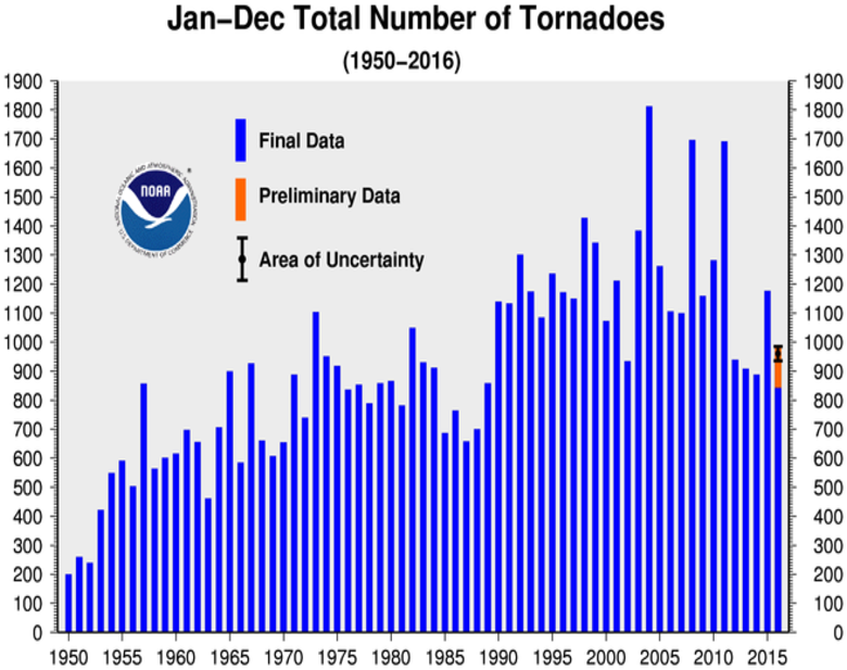
After record low Tornado year, NOAA accused of inflating number of tornadoes – ‘Graph is grossly dishonest’
Climate Depot Note: Despite NOAA Tornado data revealing 2016 as ‘one of the quietest years since records began in 1954’ and below average for 5th year in a row, the federal agency is now hyping statistics which allegedly show an increasing number of tornadoes.
Extreme weather expert Dr. Roger Pielke Jr. had noted that 2016 NOAA data revealed “good news” for tornadoes. “Looks like 2016 to end up as year with the fewest tornadoes since 1954,” Pielke wrote on December 30, 2016. (NOAA’s tornado records records begin in 1954)
Data: NOAA) http://www.spc.noaa.gov/wcm/adj.html

But now, NOAA appears to be spinning the numbers.
#
Via: https://notalotofpeopleknowthat.wordpress.com/2017/01/15/noaas-tornado-fraud/
NOAA’s Tornado Fraud
By Paul Homewood
https://www.ncdc.noaa.gov/sotc/tornadoes/201613
According to NOAA, the number of tornadoes has been steadily growing since the 1950s, despite a drop in numbers in the last five years.
They show the above chart prominently in their Tornadoes – Annual 2016 Report.
However, they know full well that it is meaningless to compare current data with the past, as they explain themselves in the section Historical Records and Trends, which is hidden away on their own website:
One of the main difficulties with tornado records is that a tornado, or evidence of a tornado must have been observed. Unlike rainfall or temperature, which may be measured by a fixed instrument, tornadoes are short-lived and very unpredictable. If a tornado occurs in a place with few or no people, it is not likely to be documented. Many significant tornadoes may not make it into the historical record since Tornado Alley was very sparsely populated during the 20th century.
Much early work on tornado climatology in the United States was done by John Park Finley in his book Tornadoes, published in 1887. While some of Finley’s safety guidelines have since been refuted as dangerous practices, the book remains a seminal work in tornado research. The University of Oklahoma created a PDF copy of the book and made it accessible at John Finley’s Tornadoes (link is external).
Today, nearly all of the United States is reasonably well populated, or at least covered by NOAA’s Doppler weather radars. Even if a tornado is not actually observed, modern damage assessments by National Weather Service personnel can discern if a tornado caused the damage, and if so, how strong the tornado may have been. This disparity between tornado records of
2016 NOT ‘Hottest’: Satellite data show 2016 NOT warmer than 1998 – Why Ground Based Temperature Fraud Matters
Barack Obama has many different government agencies in full gear telling lies to try to delegitimize Donald Trump. NASA and NOAA represent one part of Obama’s attempted coup.

Earth’s hottest year in recorded history | The New Daily
Satellites show that temperatures in 2016 were nearly identical to 1998. The claims of record warmth are due to massively tampered NOAA/NASA data.
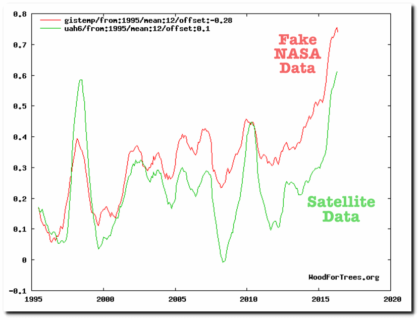
Wood for Trees: Interactive Graphs
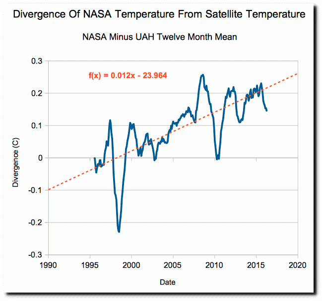
Fake NASA temperatures are diverging from satellite temperatures at a rate of 1.2C per century.
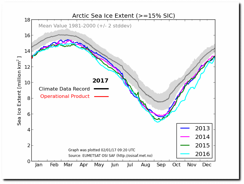
Arctic sea ice extent is starting the year essentially identical to all recent years, and is growing very rapidly.
Ocean and Ice Services | Danmarks Meteorologiske Institut
Here in the US the number of hot days was well below average, and ranked 81st hottest since 1895. Summers in the US over the past 60 years have been much cooler than they were during the previous 50 years.

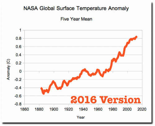
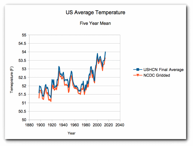
NASA and NOAA temperature graphs have been massively altered, and are useful only for propaganda. They have no scientific value.
These government agencies need to be brought under control after January 20, and their personnel in charge held accountable.
How To Tell Who’s Lying To You in Climate Debate: ‘Same method used by judges & juries’
If you are a reasonably intelligent person, and you are willing to spend a few hours on an issue, there is a very workable method to discern which side of a debate is not playing straight with you. This method is the same method generally used by judges and juries in deciding which side is going to win a trial. The method is this: look to which side has and provides the best answers to the hard questions posed by the other side. If one side refuses to answer hard questions, or is evasive, or refuses to provide the underlying methodology by which it came up with its answers, then that side has a problem. And rightfully so.
I’ll give just a few examples of this phenomenon relevant to the climate change issue.
(1) The Hockey Stick graph. The so-called Hockey Stick graph first appeared in a paper by Mann, Bradley and Hughes that was published in Nature magazine in 1998. It purported to show a reconstruction of worldwide temperatures from the year 1000 to present, in which the temperatures had remained almost completely stable for the first 900 years (the “shaft” of the Hockey Stick), and then suddenly shot up in the twentieth century in the time of human CO2 emissions (the “blade”). This reconstruction effectively repealed the prior accepted version of climate history, in which temperatures had been warmer than the present at least in the so-called Medieval Warm Period of about 1000 – 1300, and probably also in the Roman Warm Period around the year 0. When the UN’s climate-evaluation body, the IPCC, issued its next Assessment Report in 2001, the Hockey Stick graph had suddenly become the icon of the whole endeavor, appearing multiple times in the Report. The Hockey Stick seemed like the perfect proof of the proposition that global warming must be caused by humans, because anyone could see from the graph that the warming had all occurred in the era of human use of fossil fuels. Here is a version of the Hockey Stick graph from the IPCC Third Assessment Report:
Manns-hockey-stick.gif
Unfortunately for Mann et al. and the IPCC, numerous people — those nefarious “skeptics” –promptly began to ask questions about the source of the information behind the “shaft” of the stick. Thus these skeptics were questioning the ideas that temperatures had remained essentially stable for a millennium and …
Analysis: ‘100% Of US Warming Is Due To NOAA Data Tampering’
Climate Central just ran this piece, which the Washington Post picked up on. They claimed the US was “overwhelmingly hot” in 2016, and temperatures have risen 1,5°F since the 19th century.
The U.S. Has Been Overwhelmingly Hot This Year | Climate Central
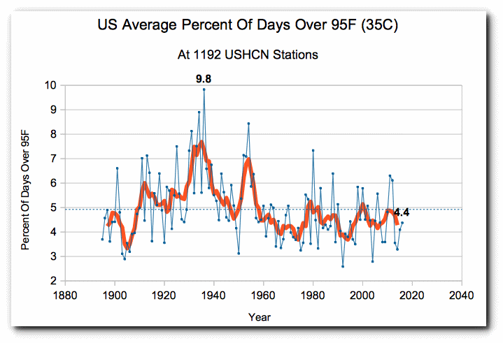
The first problem with their analysis is that the US had very little hot weather in 2016. The percentage of hot days was below average, and ranked 80th since 1895. Only 4.4% of days were over 95°F, compared with the long term average of 4.9%. Climate Central is conflating mild temperatures with hot ones.
They also claim US temperatures rose 1.5°F since the 19th century, which is what NOAA shows.
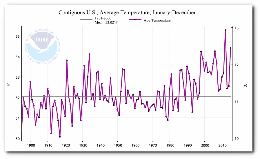
Climate at a Glance | National Centers for Environmental Information (NCEI)
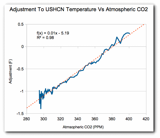
The problem with the NOAA graph is that it is fake data. NOAA creates the warming trend by altering the data. The NOAA raw data shows no warming over the past century

The adjustments being made are almost exactly 1.5°F, which is the claimed warming in the article.
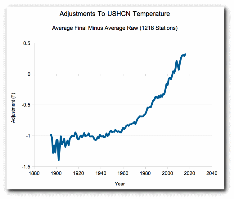
The adjustments being correlate almost perfectly with atmospheric CO2. NOAA is adjusting the data to match global warming theory. This is known as PBEM (Policy Based Evidence Making.)
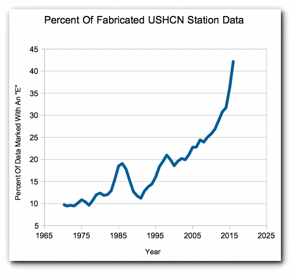
The hockey stick of adjustments since 1970 is due almost entirely to NOAA fabricating missing station data. In 2016, more than 42% of their monthly station data was missing, so they simply made it up. This is easy to identify because they mark fabricated temperatures with an “E” in their database.
When presented with my claims of fraud, NOAA typically tries to arm wave it away with these two complaints.
- They use gridded data and I am using un-gridded data.
- They “have to” adjust the data because of Time Of Observation Bias and station moves.
Both claims are easily debunked. The only effect that gridding has is to lower temperatures slightly. The trend of gridded data is almost identical to the trend of un-gridded data.
Time of Observation Bias (TOBS) is a real problem, but is very small. TOBS is based on the idea that if you reset a min/max thermometer too close to the afternoon maximum, you will double count warm temperatures (and vice-versa if thermometer is reset in the morning.) Their claim is that during the hot 1930’s most stations reset their thermometers in the afternoon.
This is easy to test by
Climatologist Urges Trump: End ‘incestuous relationship’ between government & science research
Science Under President Trump: End the Bias in Government-Funded Research
December 21st, 2016 by Roy W. Spencer, Ph. D.
You might expect that my background in climate research would mean my suggestions to a Trump Administration would be all climate-related. And there’s no question that climate would be a primary focus, especially neutering the Endangerment Finding by the EPA which, if left unchecked, will weaken our economy and destroy jobs, with no measurable benefit to the climate system.
But there’s a bigger problem in U.S. government funded research of which the climate issue is just one example. It involves bias in the way that government agencies fund science.
Government funds science to support pre-determined policy objectives
So, you thought government-funded science is objective?
Oh, that’s adorable.
Since politicians are ultimately in charge of deciding how much money agencies receive to dole out to the research community, it is inevitable that politics and desired outcomes influence the science the public pays for.
Using climate as an example, around thirty years ago various agencies started issuing requests for proposals (RFPs) for scientists to research the ways in which humans are affecting climate. Climate research up until that time was mostly looking into natural climate fluctuations, since the ocean-atmosphere is a coupled nonlinear dynamical system, capable of producing climate change without any external forcing whatsoever.
Giddy from the regulatory success to limit the production of ozone-destroying chemicals in the atmosphere with the 1973 Montreal Protocol, the government turned its sights on carbon dioxide and global warming.
While ozone was a relatively minor issue with minor regulatory impact, CO2 is the Big Kahuna. Everything humans do requires energy, and for decades to come that energy will mostly come from fossil fuels, the burning of which produces CO2.
The National Academies, which are supposed to provide independent advice to the nation on new directions in science, were asked by the government to tell the government to study human causes of climate change. (See how that works?)
Research RFPs were worded in such a way that researchers could blame virtually any change they saw on humans, not Mother Nature. And as I like to say, if you offer scientists billions of dollars to find something… they will do their best to find it. As a result, every change researchers saw in nature was suddenly mankind’s fault.
The problem with attribution in global warming research